Exploring Sugar: Fixing Cards & Making the Packaging
- Ahseek Naseeb

- May 23, 2020
- 3 min read
Updated: Jun 1, 2020
So after my last tutorial my lecturer suggested that I change the gradients for the background to a color that fades in to white or something to make things clearer for people to read. She also told me to number the steps and shortened the text so that it does not look so crowded and to not use Comic Sense and use 2 different lettering for the writting in the bubbles and the recipe part. She also gave me few lettering for me to try. Lastly she told me to add a logo of the product on each pages.
In the end while playing with the gradient I decided to make the color to fade to a very pale color instead of plain white because It was looking better that way. As for the lettering I chose to go with Jost for all the writtings and Balsamiq Sans for the conversations.

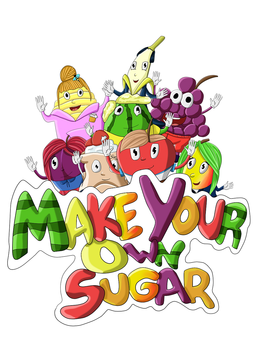
Here's what I did for the logo. I use the same style I did for the title on each card except that I mixed them us and make it really colorful in a way that it would look like a fruit basket somehow to really tell people that this kit is about fruits at first glance.


I also redrew the characters in a way that they are waving at the audience somehow and arranged them on top of the lettering to use on the front of the packaging. At first I did not put this outline on the it but I felt like it would look better with the outline on the front of the packaging and it indeed did.

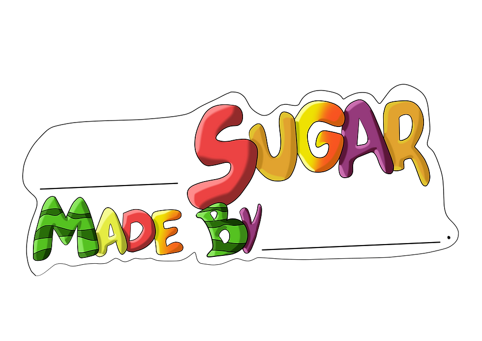
Before starting with the packaging I made the sticker for the containers and I followed the same style as the logo.

Here's an example of how it works

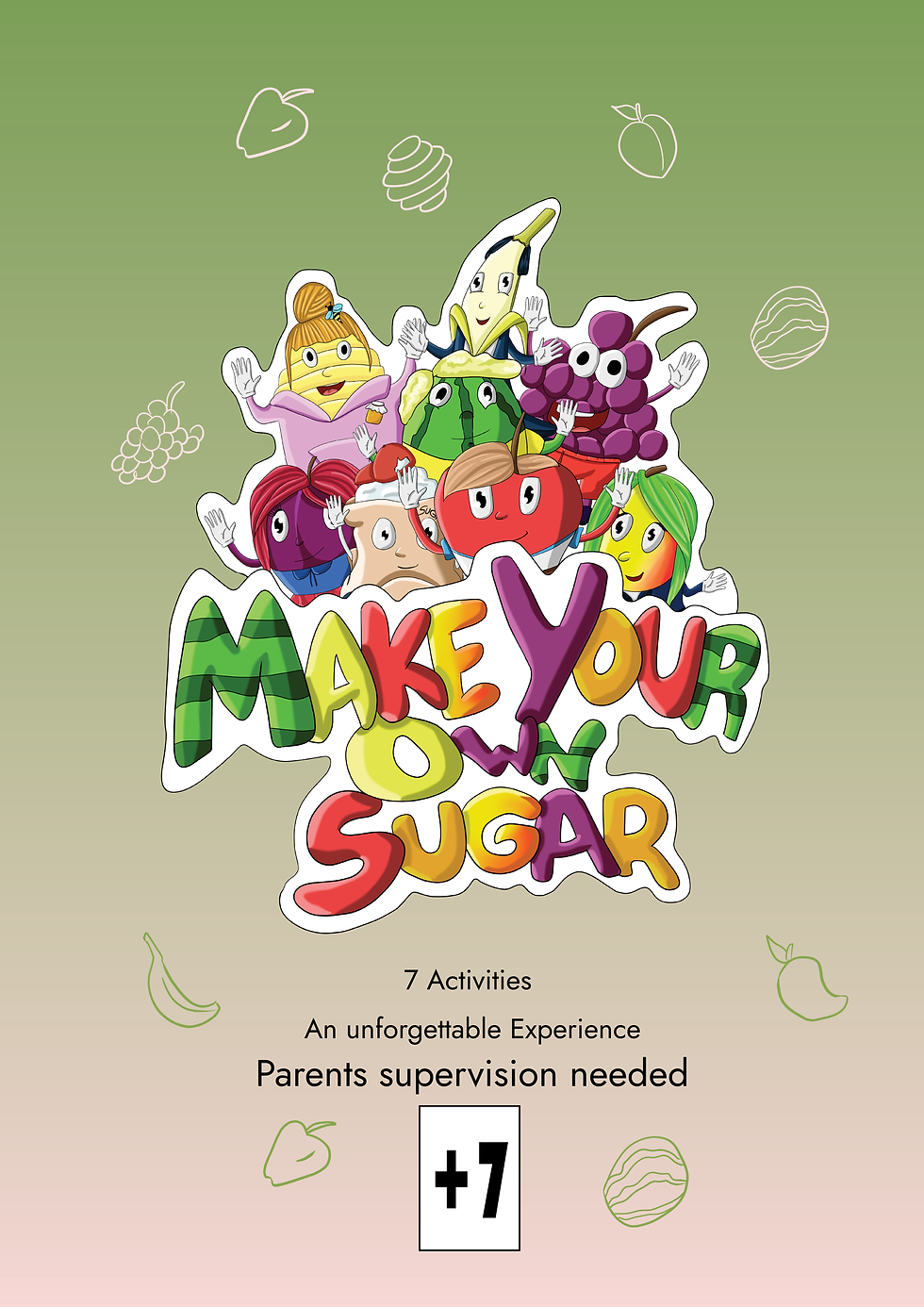
As for the packaging I did these simple illustrations I wanted to make and I left them crooked and not proper because I wanted to give them that style. At first I wanted to make them white only but after arranging it on the packaging it was looking dull and weird so I decided to use the colors of the packaging and I did one with the green color and an other one with the white color of the gradient.
I chose the background of the grapes to use for my packaging because it was green and would make my illustrations pop out more and also because the product is about fruits and when you think of fruit you think of fresh which makes you think of green

This is going to be my front part of my packaging, you can see how I used the illustrations on the background. I also included details like it contain 7 activities and that parents are needed for the activities and that it for children of 7 and above. the "an unforgettable experience" is mostly because once you learn it you don't really need the kit to do it again and it's also to attract people's attention and make them wonder what this kit is about.

This is going to be the right side of my packaging, It has this little conversation between the characters who are talking to the audience and it's made mostly for children to know what the kit is about. I also include the information that parents supervision is needed and that it's not for children below 7 years old.

This is going to be the left part and this side is more to parents, in fact I'm not sure if children would actually even look at this side and try to read. but well it has information that it's for children 7 and above again and I also put it twice on the same side to really put emphasis on it. I have also include other details like the fruits are not provided in the kit and that it involves a lot of cooking that's why parents are needed. I choose a yellow fill for the text box just to attract attention more and because the yellow color suits my green background.
Yellow also indicate caution.
Here are 2 other sides and the back. As you can see these are very simple it's because it's mostly the sides that you won't really see when in a store or something when buying so I did not really put emphasis on them.
Also I put the logo and the age restriction and that parents are needed on several sides just so that if it's being stored in a shop in different position rather than displaying the front, people will be able to see those important details.


Comments