
Gradshow and SOI Part 2
- Ahseek Naseeb

- Sep 18, 2021
- 2 min read
GradShow
For the graduation show identity, the idea shifted a lot based on the comments I have received, it was a bit of some chaos because we had such a little time to do it here are some of the progresses
Here are some of my sketches

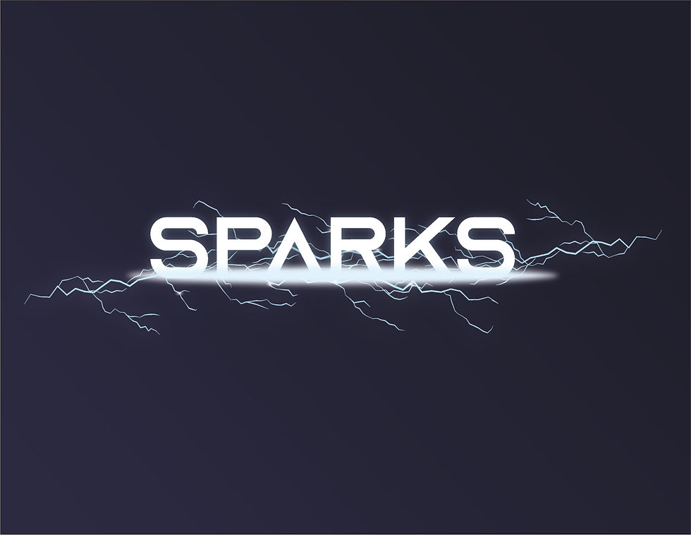
So first because my lecturer told me the brand name was not really reflecting the gradshow in a cheerful and creative way so I changed the brand name to sparks instead, because ideas sparks. Still keeping the idea of battery and electricity I tried to make something direct


I also tried to make a sort of template to put words in but I did not feel like I was getting anywhere and it looked still not very cheerful and happy so I switched to another idea.
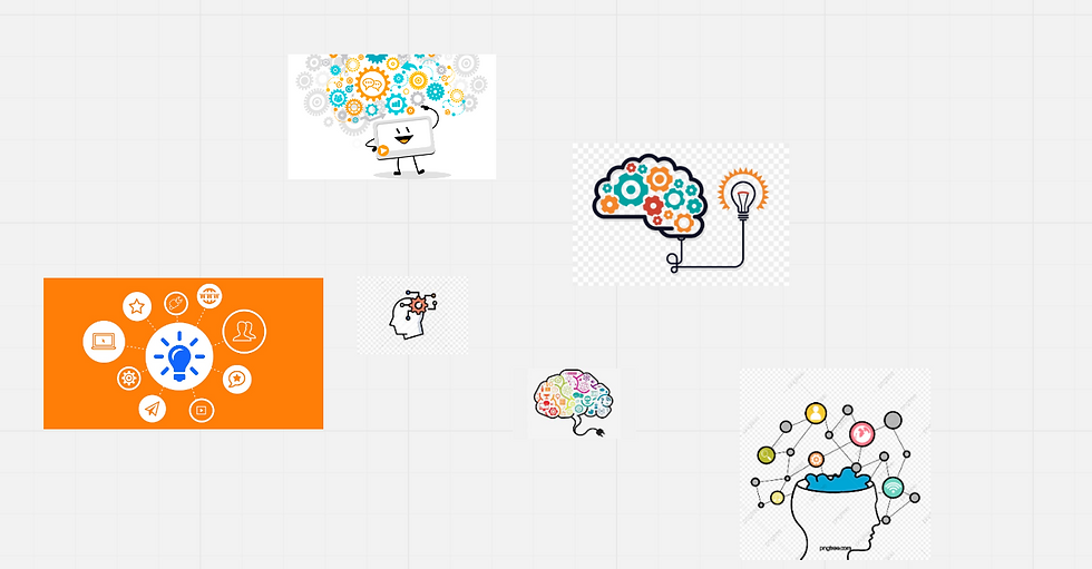
These were my inspiration to try to make it more cheerful. I looked for something with a lot of rounded shapes and bright colors.
And this is the brand I made. The idea is a mixture of a bulb and a brain with some sparkles on the brain to bring the idea of ideas sparkling. There is also a plug at the bottom because we a are basically gonna connect our ideas to the businesses we are gonna go to. And the typeface chosen were rounded to make it more cheerful.


However I got the feedback that logo was too detail and that it was still unexplored and too literal.
So here are some more exploration I made.


But again the feedback was the same. It was still too literal and too detailed and on top of that I was also told that the colors were too overwhelming. And I asked to make it even more simpler and try to use elements from the logo as design elements.
So I tried to change the approach completely and experiment with a completely new style and new palette of colors.


This time I was told the logo brand identity was much better, but the graphics could be used better in a way that it has more meaning.
I also prepared a few animation at this point.


These small animation was to display the brand voice better and the story a little bit.

I tried to figure out how to use the design elements while preparing the slides but i was a bit out of time at this point so I picked up the most literal way to use the elements.
After doing these little changes I changed the animation and this is my presentation video with the animation.
In the end I really prefer this one more than the other trials I made. However there is still a lot to improve and based on the critic session I now have a clearer understanding of how I can improve it more and I feel like I have learned a lot more on branding with this project.
Statement of Intent
This is my final for my SOI and 10 Annotated Bibliography.


Comments