The Scrooge is a photonovel about greed. The plot follows Richie, an employer with a well-paid post at a good company, but he lives a very cheap life and is always paranoid about his money. He also has a nemesis; Manny who has the same post as him but lives a very luxurious life, who he despises a lot and wants to become richer than him. However, both of them are not who really they are.
The story was inspired by folklore stories like RUMPLESTILTSKIN and The Legend of Wountie. As for the concept it came from the 4 types of greed mentioned in the bible, the hoarder, the over-spender, comparison, and entitlement, which is depicted by the 2 main characters Richie and Manny along with the story.
Woodchuck Regular was used for the speech as it is a "rounded serif comic style" font and fits the context of the photonovel which takes place in an office but is at the same time a comedy.
Qarmic Sans was used for the "action text" as this one is more "comic-ish" and bolder for the actions to stand out from the photographs as they will not have a box behind them.
Woodchuck Light
ABCDEFGHIJKLMNOPQRSTUVWXYZ
abcdefghijklmnopqrstuvwxyz
0123456789
Qarmic Sans ABCDEFGHIJKLMNOPQRSTUVWXYZ
abcdefghijklmnopqrstuvwxyz
0123456789
The brief for this project was restricted to using only 1 actor for all the characters. The brief also required using a minimum of 1 color for the cover and a maximum of 1 color for the inside pages.
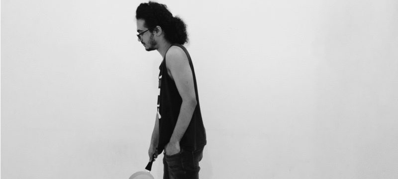
All the characters were played by myself and props such as wigs and fake beards were used to make the characters look different and I also went on shaving my beard to make one of the characters. And photoshop was used to make the characters live in the same space.
All the characters were played by myself and props such as wigs and fake beards were used to make the characters look different and I also went on shaving my beard to make one of the characters. And photoshop was used to make the characters live in the same space.
Green was a favorable color for this photonovel since the story is about greed, however, using too much would make it overwhelming to the readers and break the comedy atmosphere. Therefore the inside pages were left black and white. As for the cover, green was only used for the title to let the front image reflect the inside of the book.
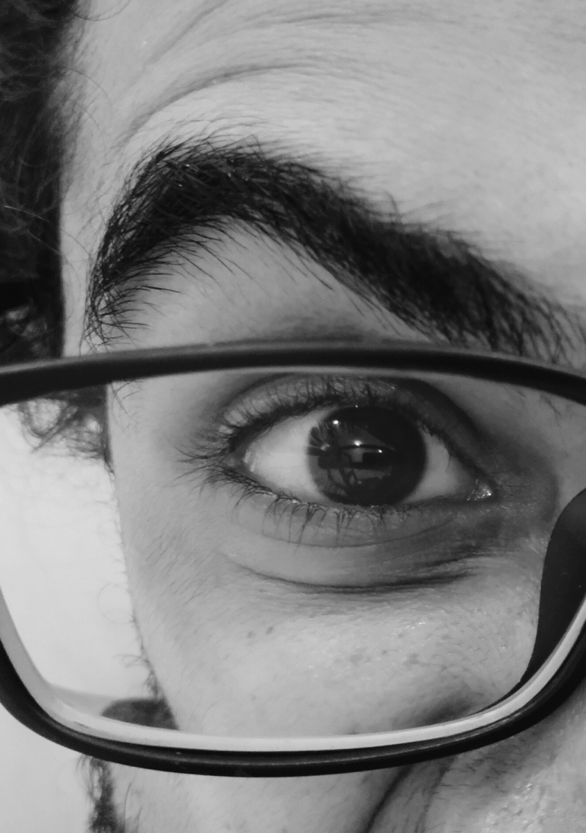
The cover of the book was inspired by Stanley Kubrick's The Shinning Movie poster as the main character is a little bit psycho but with a little twist to give the audience what the book is about. Manny was placed in the main character's eyes as he envies Manny's life and a RM600 note was placed in his glasses because he also looks up for money.
For the title of the book, the dollar sign has been used for the S and again the RM600 note was used as a texture,
-
1st to give the typo a little bit of roughness to relate to the paranoid main character.
-
2nd to again tell the audience that the story is about greed.