
Week 12
- Ahseek Naseeb

- Jul 2, 2021
- 4 min read
Everything About One Thing
For the EAOT I decided to make a magazine in the end since I really wanted to try magazine layout. And also the images that I have gotten seemed well suited for a magazine.
I also reorganized the contents of the magazine and decided to not make the arts for the interviews because of the way that I have arranged it in the end.
I took references on these magazines:
Guitar Techniques, 2017. All the Blues Chords You'll Ever Need. (267).
Sustain Magazine, 2013. (1st).
EMPIRE, 2021. The Falcon And The Winter Soldier. (387).
SCREAM, 2018. Halloween 2018. (50).
I decided to use a fonts that were a bit roundish and modernish that seemed a bit formal but not too format. I also looked for a super bold font for the titles because I wanted to play around with them a bit.

This is the moodboard that I created. Then I decided to use Aileron for titles because it had a big font family and was really bold in "Black", Monsterra for paragraphs because it looks modernish and is a bit rounded as well. and Play for intro paragraphs and other special wordings in the magazine because it was a lot contrasting compared to the others.
Here's how I played around with the titles.
I also edited a few of the pictures recieved from the interviewees to make them fit the aesthetic of the magazine better.
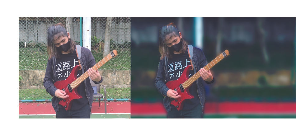
Some such as this one I had to discard later on because the images was too blurry and grainy compared to the other images.
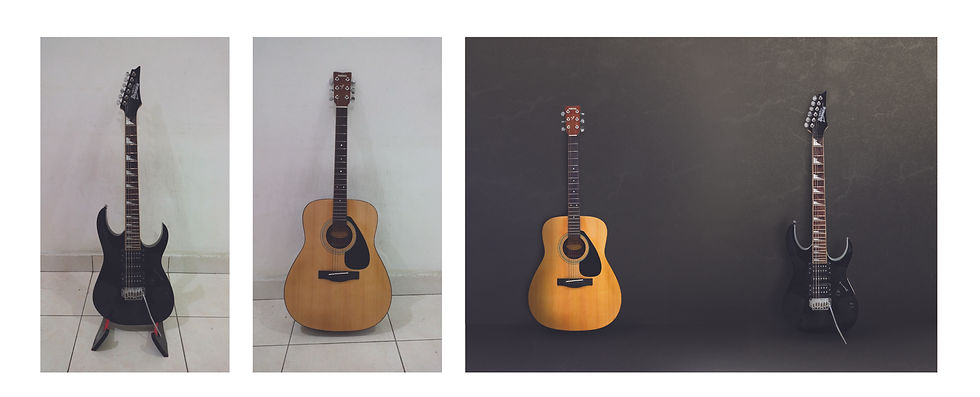
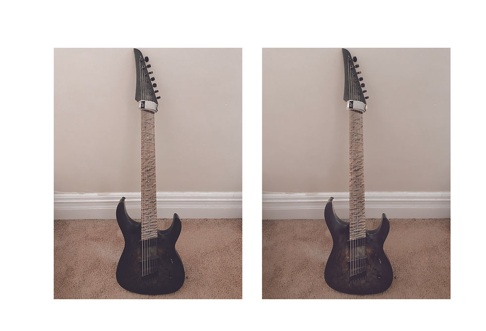
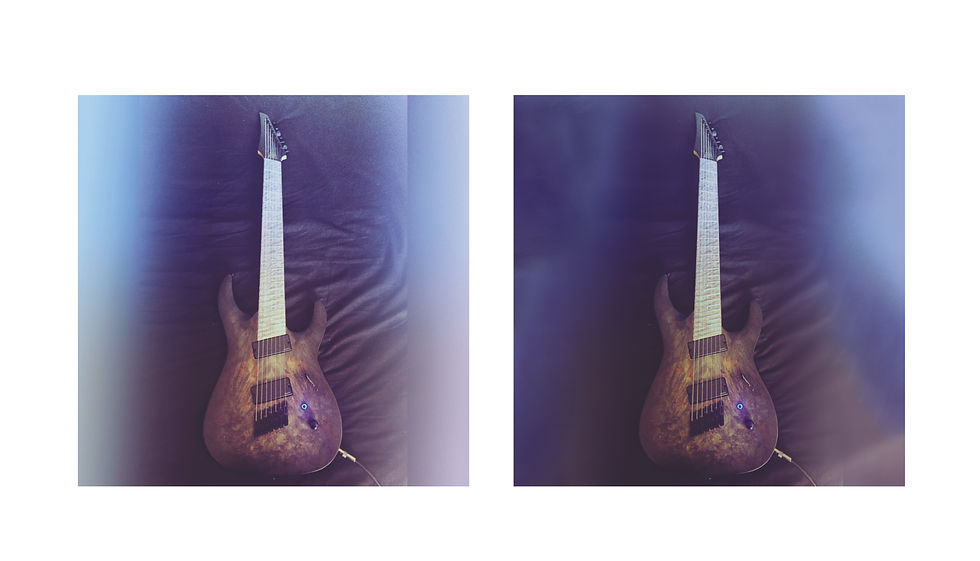
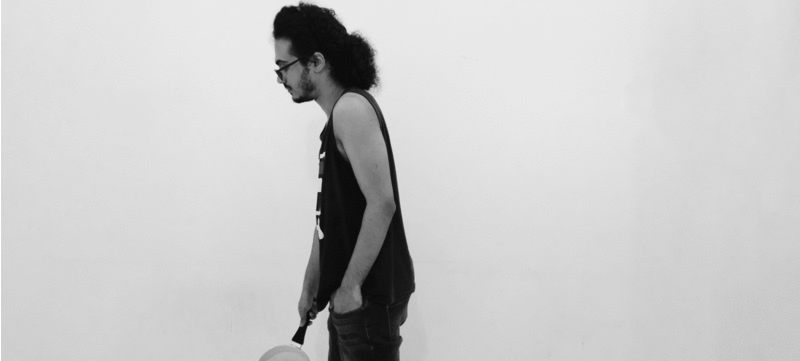
I also took some images of my own guitars for the project.


I even tried to do different arrangements of my own recording equipments to put in the magazine.
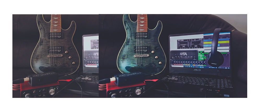
This is after I've edited the arrangement I choose in photoshop.
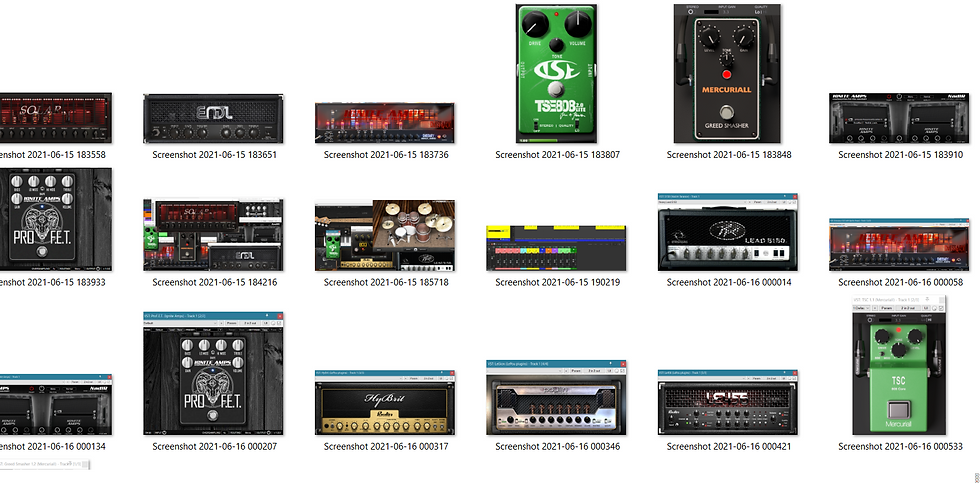
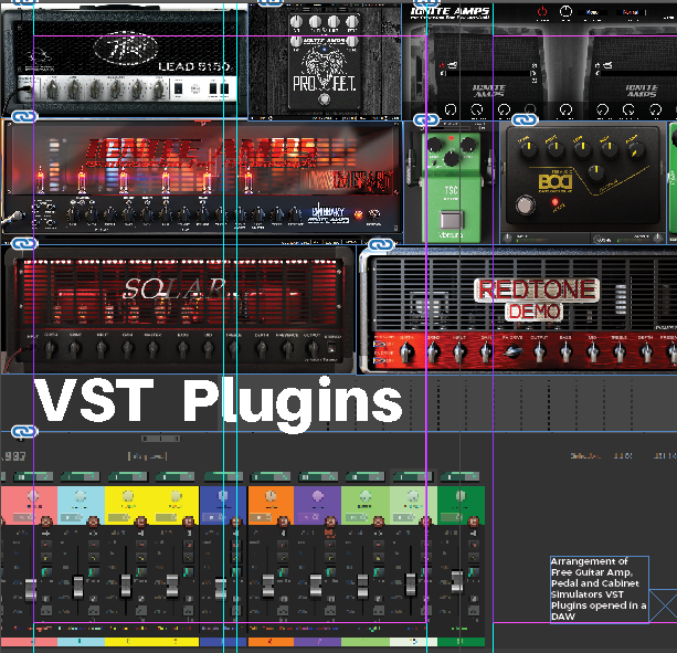
I also took a few screenshots of free guitar plugins I use for recording and after trying several different ways to display them, I decided to crop and arrange the individual screenshots on Indesign itself.
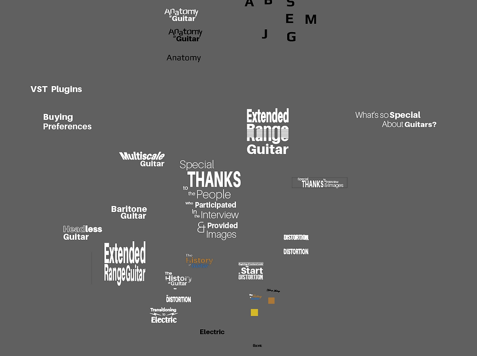
As for the layout of the magazine apart from the title page which I kind of wanted to follow the white spaces of the images I recieved and play around with the layout, the rest I used a 2 column layout and made the images very large as I had little text.
And after a lot of corrections here and there, here's some of the spreads.


And this is the idea that I had for the cover.
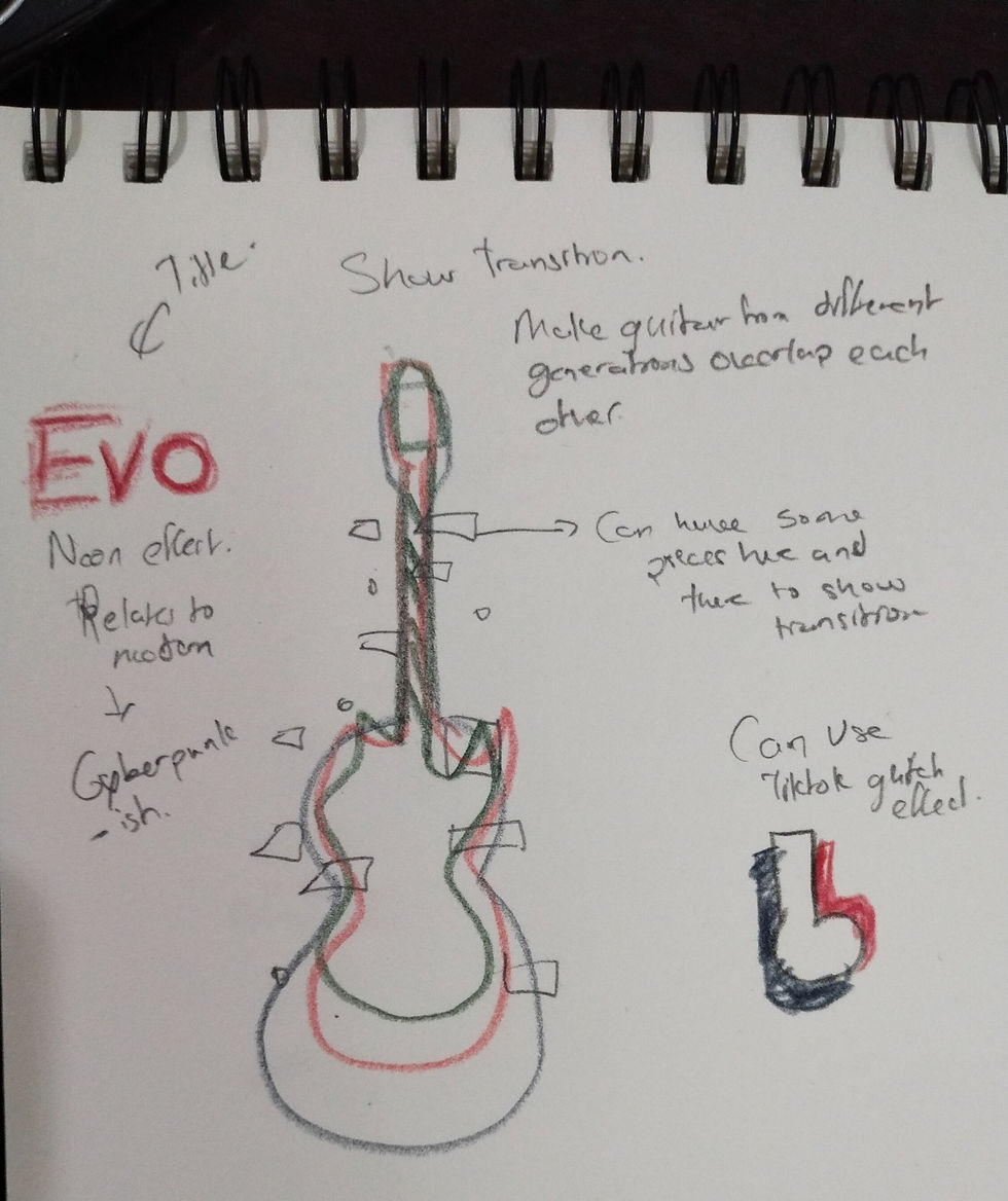
Here are a few Inspiration I found for this effect.


1st image :bhosle, s., 2019. Depression Cherry. [image] Available at: <https://www.behance.net/gallery/74572415/Depression-Cherry> [Accessed 2 July 2021].
2nd image : 新艺联 JPGStudio, 2020. Evil Minds Movie Poster. [image] Available at: <https://www.behance.net/gallery/100211973/Evil-Minds-Movie-Poster> [Accessed 2 July 2021].
3rd image:Osama Elsheemy Studio©, 2020. 404 Error (Glitch). [image] Available at: <https://www.behance.net/gallery/90911293/Error-404-(Glitch)> [Accessed 2 July 2021].

And this is what I did for the cover. Compared to the references I had I wanted mine to stay in colour instead of being black and white so to achieve that I use different copies of the same image with different blending modes and transparency level. I also had to make the guitars slightly slanted because the frets were looking too messy with the transparency.
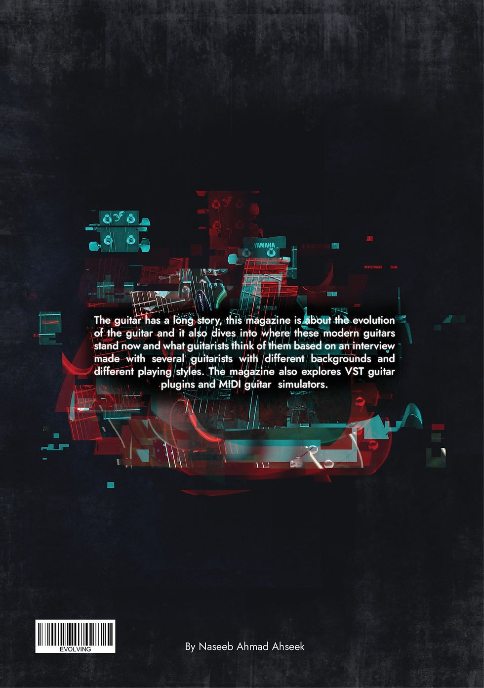
As for the back cover it is much simpler and I also wanted to make it completely blend but It looked too blank so I use the glichy blue and red images and cut them even more put them here and there in a messy way and created design with it.
And here are the mockups...


And if you want to read the pdf.
Photonovel
For the photonovel it took 2 to 3 days full to take all the pictures but once done it was very easy for the rest.
Here's how I edited a few of the pictures.

And then I placed the images and the texts in InDesign.
As for the cover I wanted to make it similar to Stanley Kubrick's The Shinning Movie poster. And I already had a few pictures with a similar face.
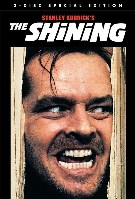
Kubrick, S., 1980. The Shinning. [image] Available at: <https://stephenking.fandom.com/wiki/The_Shining_(film)> [Accessed 2 July 2021].
So I jumped on photoshop and did several different variations of the idea I had, which was to put Manny inside Richie's eye and while doing it I also got the idea to put a RM600 note on it to emphasis that the story is about greed.
The name I choose for the book is The Scrooge as a scrooge is a guy who spend as less money as he can and is not usually generous and can be sometimes mean which is half the characteristic of Richie.
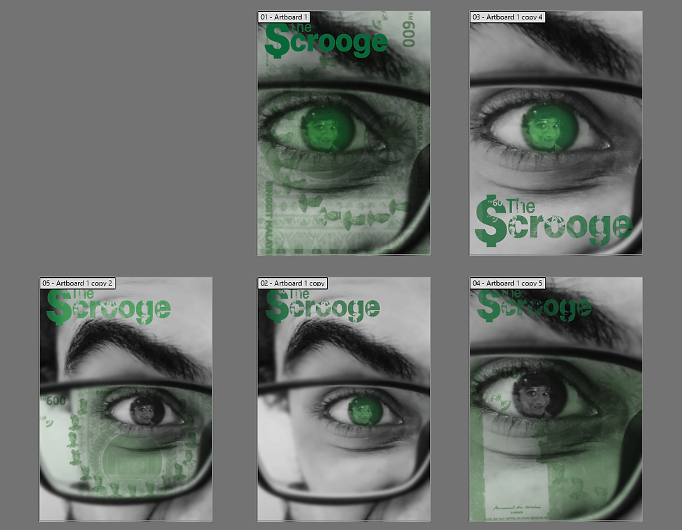
After looking at each of them for a long time I preferred the 5th artboard as the note is in his glasses which shows that it's something that he is striving for and you can see Manny in his eyes, as well as the zoom amount, is also the right amount to see his annoyed/ irritated face.
For the lettering I made the S as the dollar sign to relate to money more and I also put the RM600 note as a texture inside as when it was flat it was looking too passive for the book.
And here is the Mockups...


And here is the pdf
The Professional
I have gone and read a bit about brand archetypes and I have learned them and understood them. I also read about the different types of logos to get a better idea of what kind of logo I can make. Then I started figuring out which brand archetype suits me better and I started jotting down some notes.
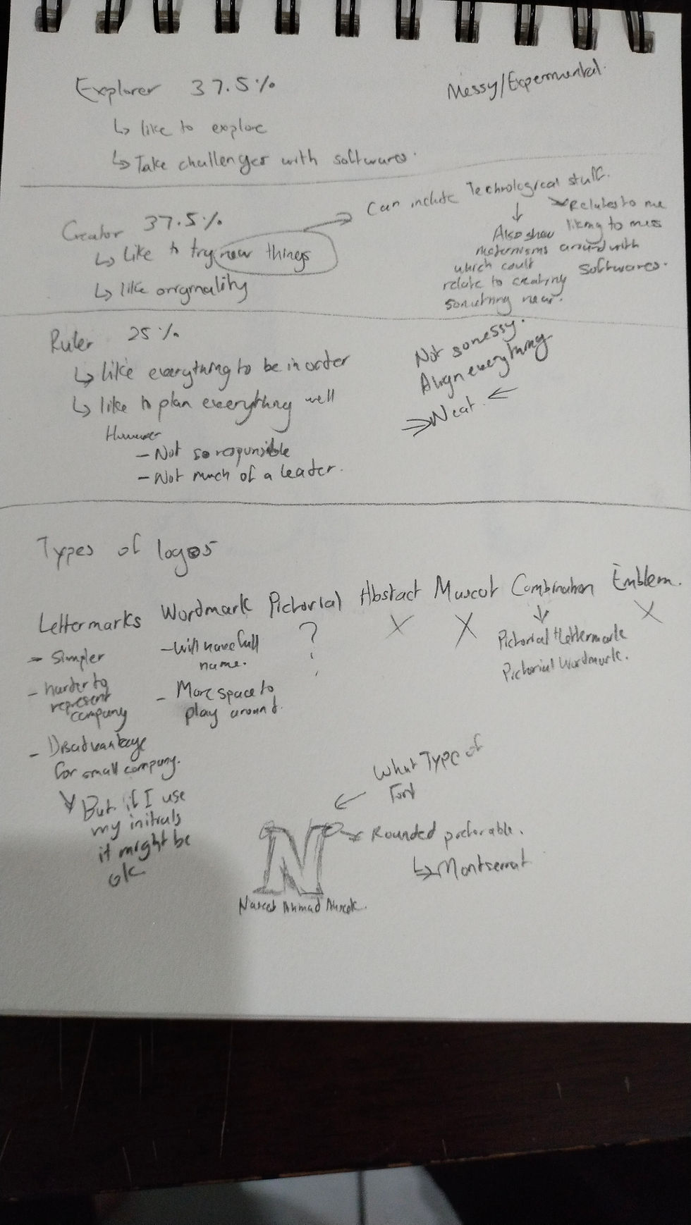
Briefly, I found that the explorer, the creator, and a little bit the ruler suits me in some way. as for the logo I think I will go more towards a lettermark instead of a wordmark but I might also do a combination. I want the logo to be well aligned to related to the ruler but also be quite experimental in a way by pushing the lettermark on illustrator a bit to show how I like to explore and lastly I also think that maybe I could use some thing like neon light or glitch effect to relate to modern so that can also relate to modern and original for the creator.
Houraghan, S., 2018. How to use Brand Archetypes To Hack The Mind Of Your Customer [EXAMPLES]. [online] Iconic Fox. Available at: <https://iconicfox.com.au/brand-archetypes/> [Accessed 2 July 2021].
Thehartford.com. n.d. Brand Archetypes & How They Can Help Your Business | The Hartford. [online] Available at: <https://www.thehartford.com/business-insurance/strategy/brand-archetypes/choosing-brand-archetype> [Accessed 2 July 2021].
Morr, K., 2019. Do you know the 7 different types of logos?. [online] 99designs. Available at: <https://99designs.com/blog/tips/types-of-logos/> [Accessed 2 July 2021].


Comments