
Week 14 Part II
- Ahseek Naseeb

- Aug 7, 2021
- 2 min read
The Professional

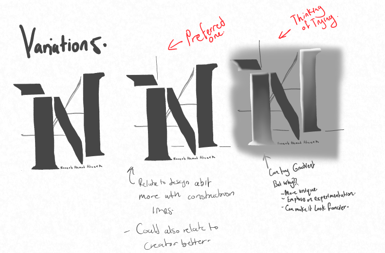
For my own branding I found that the archetypes that relates to me more are the explorer, the creator, and a little bit the ruler as I like to experiment a lot with softwares and I like to take challenges to keep improving myself, I like to make my work standout from my surroundings and I also like everything to be well organized and well planned.
Based on these point I decided to make my brand bold, well organized and aligned and try to include some elements of experimentation and design that would relate to my practice. Here are some of my ideas and thoughts on them as I proceeded.


The colors that will be used are mostly black and white as black is bold on white and white is bold on black. Black is also the color of strength, authority, elegance, formality, and sophistication (Bourn, J., 2010). White on the other hand represents brilliance, illumination, cleanliness, and perfection (Bourn, J., 2010.). Grey was also used because it emphasizes the sophisticated and bold look and it also breaks the negativity that black brings a little (Bourn, J., 2010.) and also because it works well with the black and white as a sub-element.


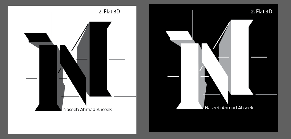

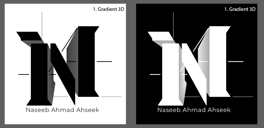

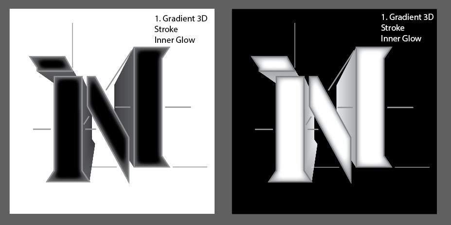


After several trials on Illustrator the idea of a 3D extrusion was rejected as it did not looked nice as a logo.
And here is the finalized logo


Lastly here is the branding guidelines.
And This is my resume and cover letter


Bourn, J., 2010. Meaning of The Color White |. [online] Bourn Creative. Available at: [Accessed 17 July 2021].
Bourn, J., 2010. Meaning of The Color Grey | Bourn Creative. [online] Bourn Creative. Available at: [Accessed 17 July 2021].
Bourn, J., 2010. Meaning of the Color Black |. [online] Bourn Creative. Available at: [Accessed 17 July 2021].


Comments