
Week 9
- Ahseek Naseeb

- Oct 25, 2020
- 2 min read
Updated: Nov 18, 2020
CLASS
So we had a lesson about asking stupid questions. It's something that we've been told already but indirectly somehow, this time it was an in depth kind of class about it. Sometimes we have to unlearn to learn.
After that we had a workshop where we had to ask stupid questions on our Things project and the project of our classmates.
Here is my stupid questions 🤣
THINGS
So I have gotten 36 responses so far for my survey and I can conclude from there is that
People don't really use different knives for their different purposes but rather use them to their own will. Only a few knives like the bread knife and the butter knife that people recognized but the others people just don't really care it's made for what.
However on the superstition side people do not really know any, only a few knew and the illustration that most of them recognized was the protection while sleeping one.
A few things that I did not expected was that people view knives as a useful tool more. And about half of them do not really consider it to be too dangerous.
In my last tutorial my lecturer suggested that I ask people pictures of knives and study them
Mine


Person 1


Person 2


Person 3


Person 4


So far after looking at those pictures, I realized that maybe I can also try to learn about those person based on the knives they have.
After reflection I concluded that knives were just a tool in the stone age, then it got some negative view when people started using it for war and in some culture it was also related to black magic. But not, because we are living in a peaceful era (excluding corvid times), people forgot about the bads of knives and view it more as a useful tool because every households uses it to cook. You can even kind of see the lifestyle of people through the knives that they have in their kitchen.
GD MAP
For the GD Map, the feedback that I got was that the lettering was hard to read because it was too decorative, the background page texture was too distracting and there was a few other things my lecturer told me to fix.
So I went searching for other fonts and I found Segoe Print which match the Rock Salt font and was more readable. And for the texture I played around with blending modes again and colors and made it lighter. Oh I also tried one without any texture and did not like it because it was suddenly too flat


This is the updated version of my 500 words.
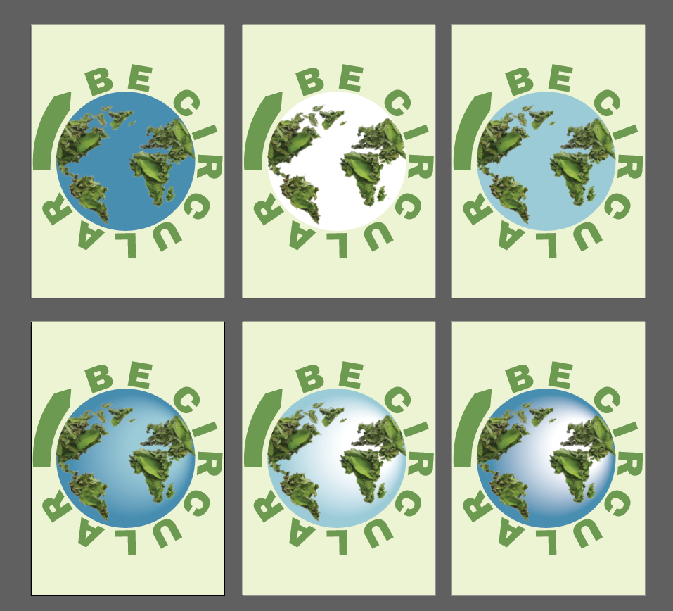
I AM AMPLIFIER
The feedback that I got from my I Am Amplifier placard was that the earth could be enhanced by trying more colors like a solid white or a solid blue. So I mess around with the colors a little bit more, I really did not like the solid colors so I tried gradient but with different shades of blue a dark blue was not going well with the leaves continents and a lighter blue color was too white so I decided to keep it the same color.


Comments