
Image Making Inspired from Stephen Sagmeister's Works
- j19031193
- Nov 6, 2019
- 3 min read

So we had a workshop today which was based on Stephen Sagmeister's works which are hand written and arranged then captured in a picture. We also had a homework before that class on image making and we learn a little bit on how we can arrange a composition without any computer software. Beside this we also got some example on how people uses this techniques for their work from our lecturer in class.
The we were asked to pick up an object and paint it in whatever color we wanted. Well I chose a plastic cup and I painted it completely beige because it was just in front of me haha. Then we were asked to look for a Headline from journals or magazines then exchange it with our classmates so that it would be very random. So the headline that I've got was "power"
Well now I had to make a composition by relating my weird beige cup and the word "POWER" and damn it was hard haha.
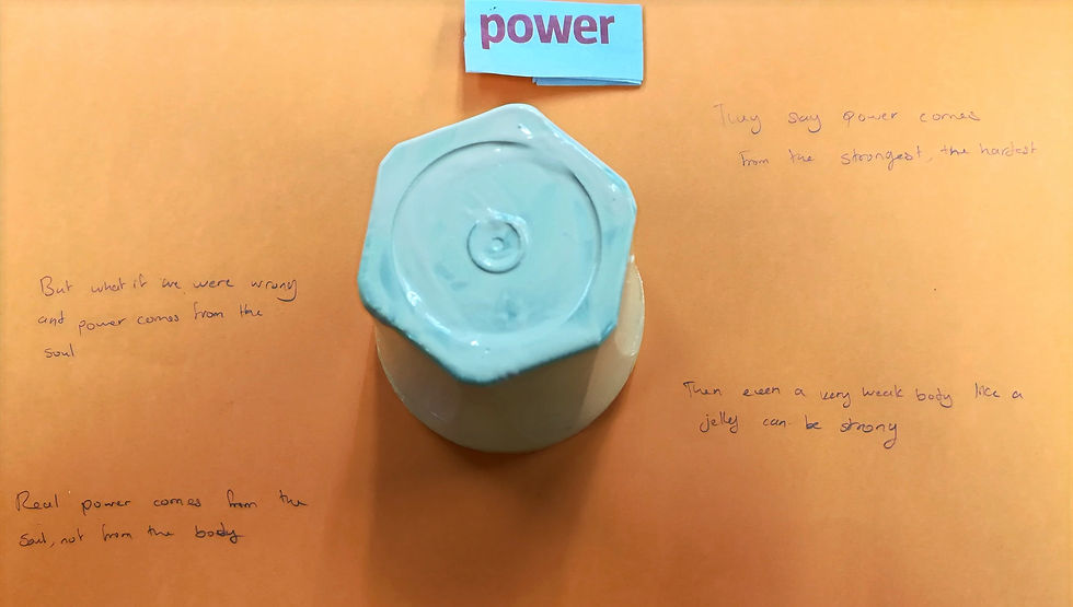
So this is my first work which is very weird af haha. The cup in beige looks like jelly so I though that it has a very weak body like a jelly and my theme was "POWER" so I thought what if I use that to say that you do not really has to have a strong body to be strong and that strength also means the way you deal with problems/issues or deal with your fears. So then that strength does not come from the body, it comes from the soul, from the mind. So yeah, that's what those writings talk about.

So this is my second arrangement which I basically used the cup as a mountain and put the word "POWER" on top of it because it because it's usually how power is demonstrated and at the back I have written the word "Domination" because some people when they have power in whatever form whether it's money, strength or whatever, they tend to become a bully in a certain way. For the background I have used a red and orange to demonstrate that bad angry feeling that you usually get toward those people and it is also the reverse way the angry kind of demonic aura that these people have around them haha.

This is my 3rd work where I have turned the cup in the right way and and put the power headline inside it just to demonstrate how one can fall down while striving too hard for power and for the colors I have use for the background, the yellow is on top and it represent the good side of having an ambition for power and the red background show the bad side.
So next we had to search for another highlight that relates to the object and paint it on the object. So I had pamphlets from a university about foundation year and my cup was looking very art and craft so I used it. Our lecturer told us to paint it on the object so because it was art and craft I decided to write it really messy like a kid learning art somehow.


My lecturer also told me to try different ways to arrange it in a picture ti display the whole highlight so here are few that I did. I took the picture on the ground to get a contrasting background to pop out my work more and also the texture of the floor really complimented the word.
So this exercise taught me to make a composition without any software and also to find relation between a word and an object, to built a concept somehow. However I have rush my work a little bit too much and made them messy and also I had to work with limited resources and find a concept in little amount of time. So of course my work was not like Stephen Sagmeister but with practice, more knowledge, more time and better tool and materials I am sure one can I will be able to make something almost as good as him.

Comments