
Subjective Mapping
- j19031193
- Nov 29, 2019
- 7 min read
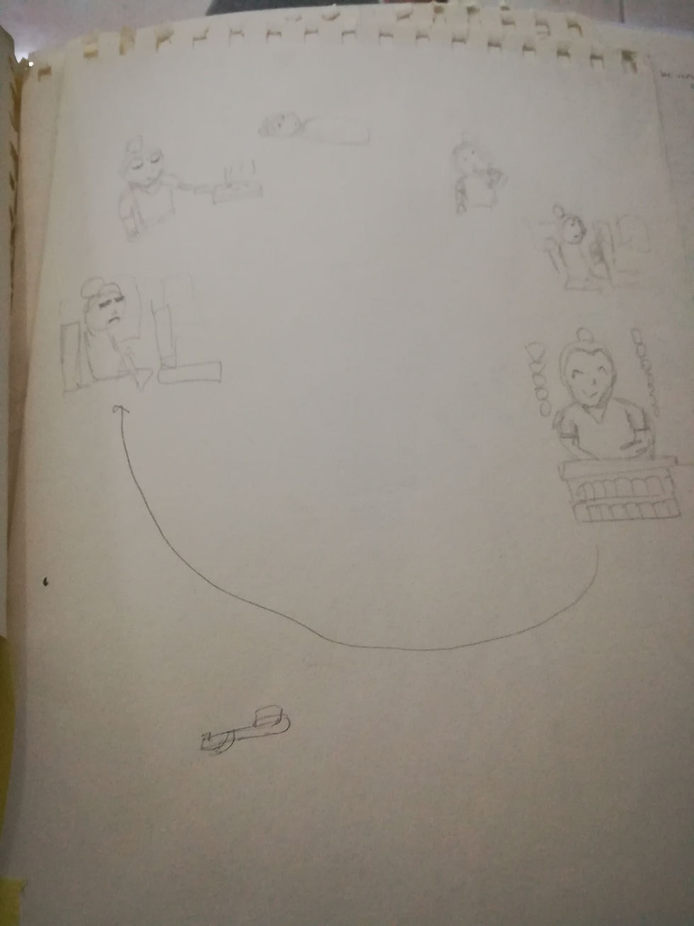
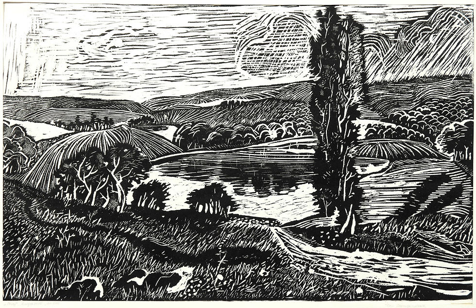
For design process I also went to Brickfields to research and at first I didn't knew what to look for so I just made random sketches of interesting places.
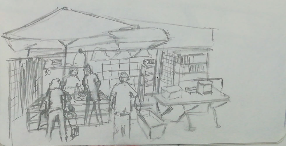
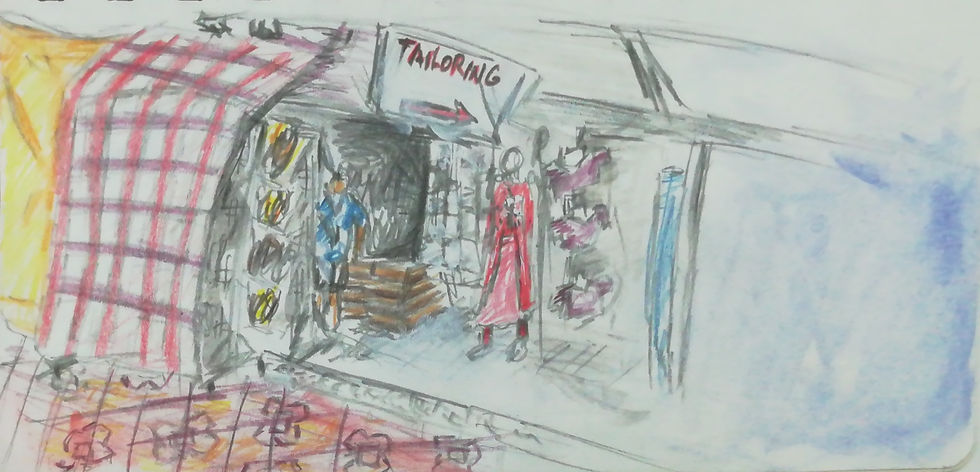
And I've got these 2 sketches which when I showed to my lecturer she told me to try investigate more about these shops as there were many small shops like this in Brickfields. And this was the beginning of my project as it was a great idea that I've got to develop.
So I went back but this time instead of sketching, I wrote...
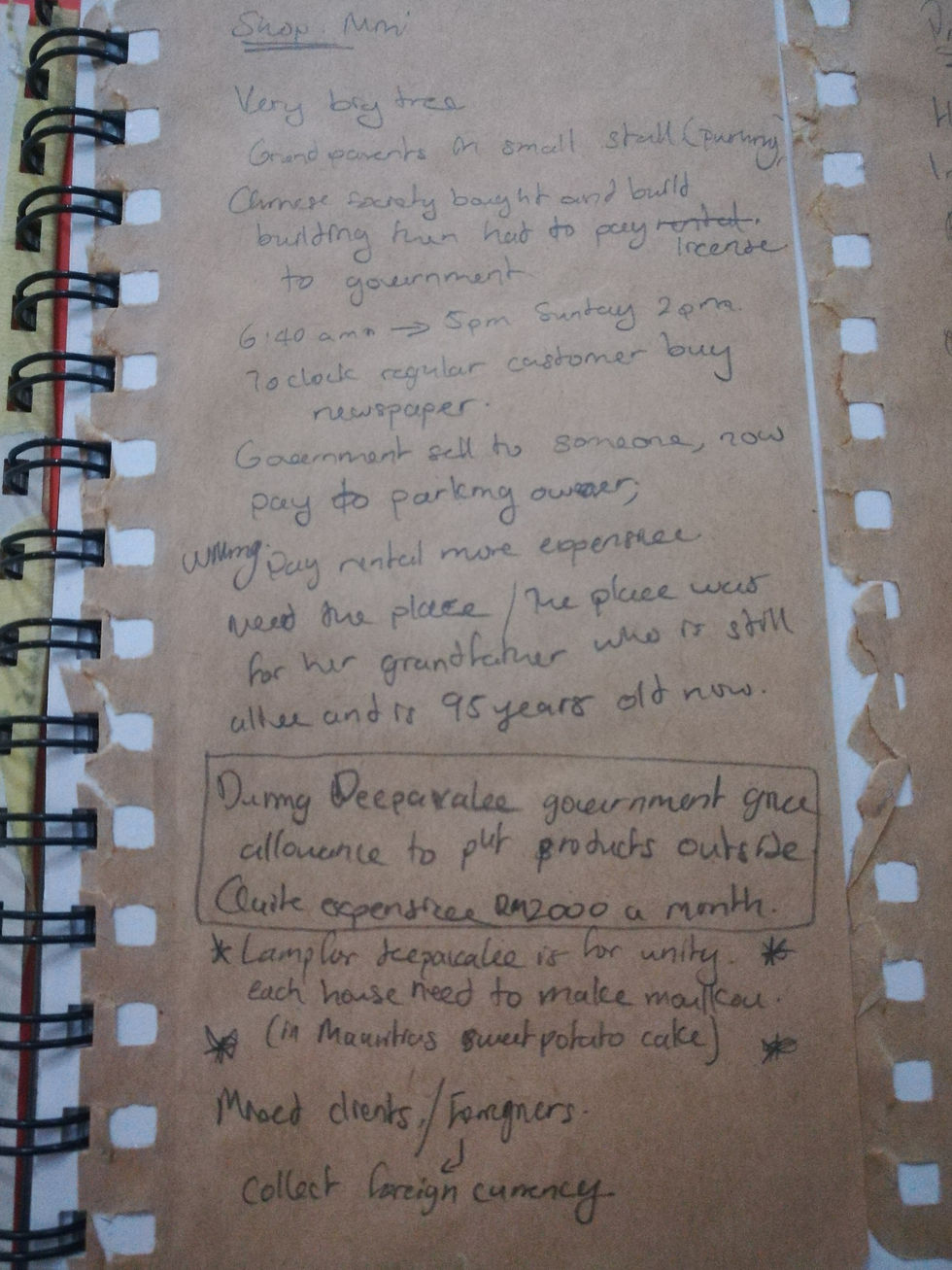
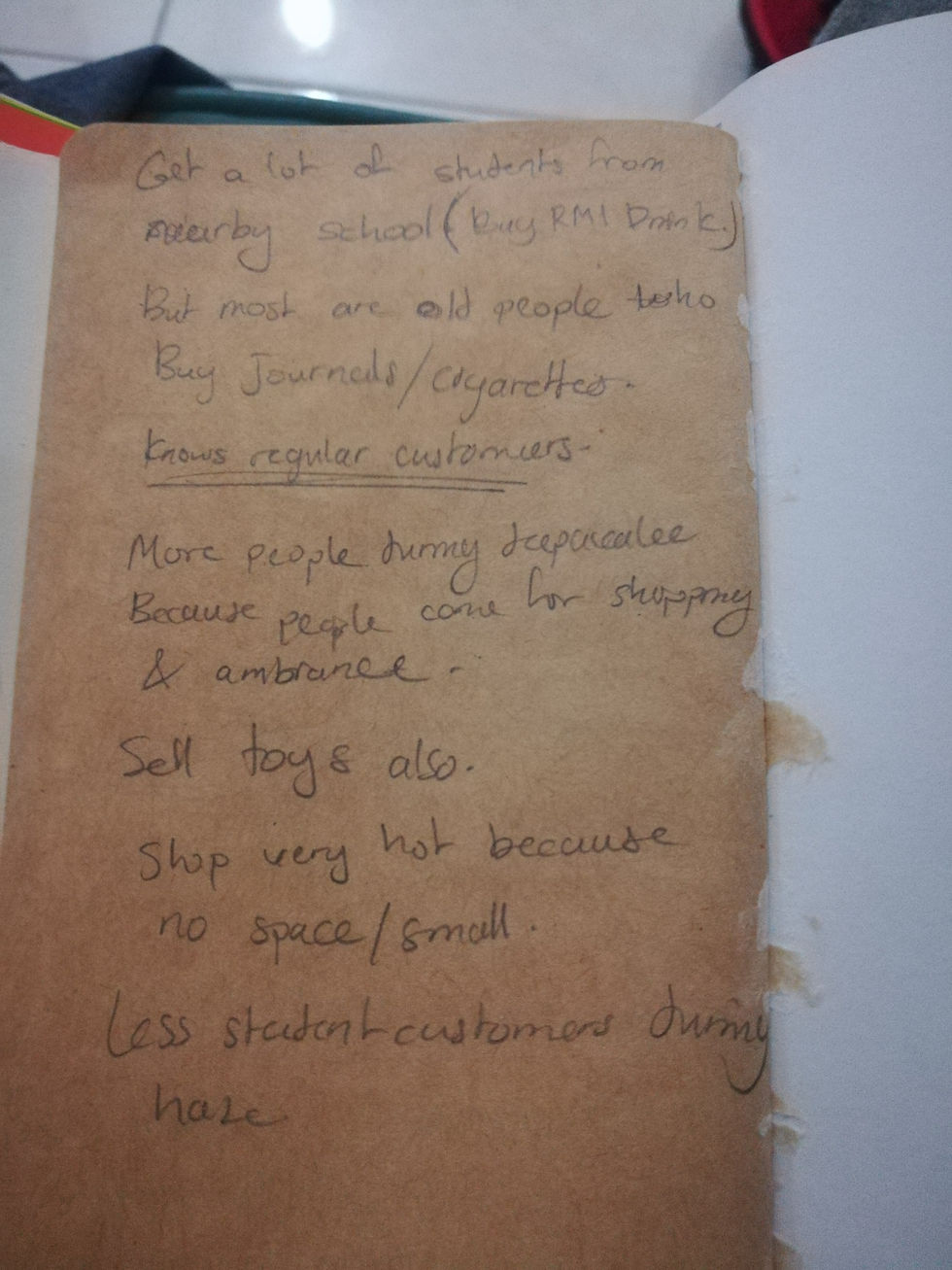
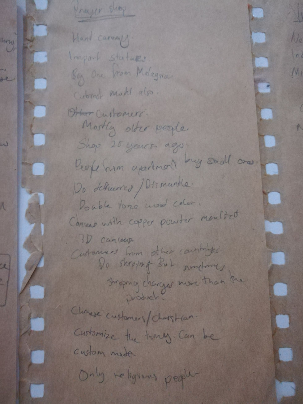
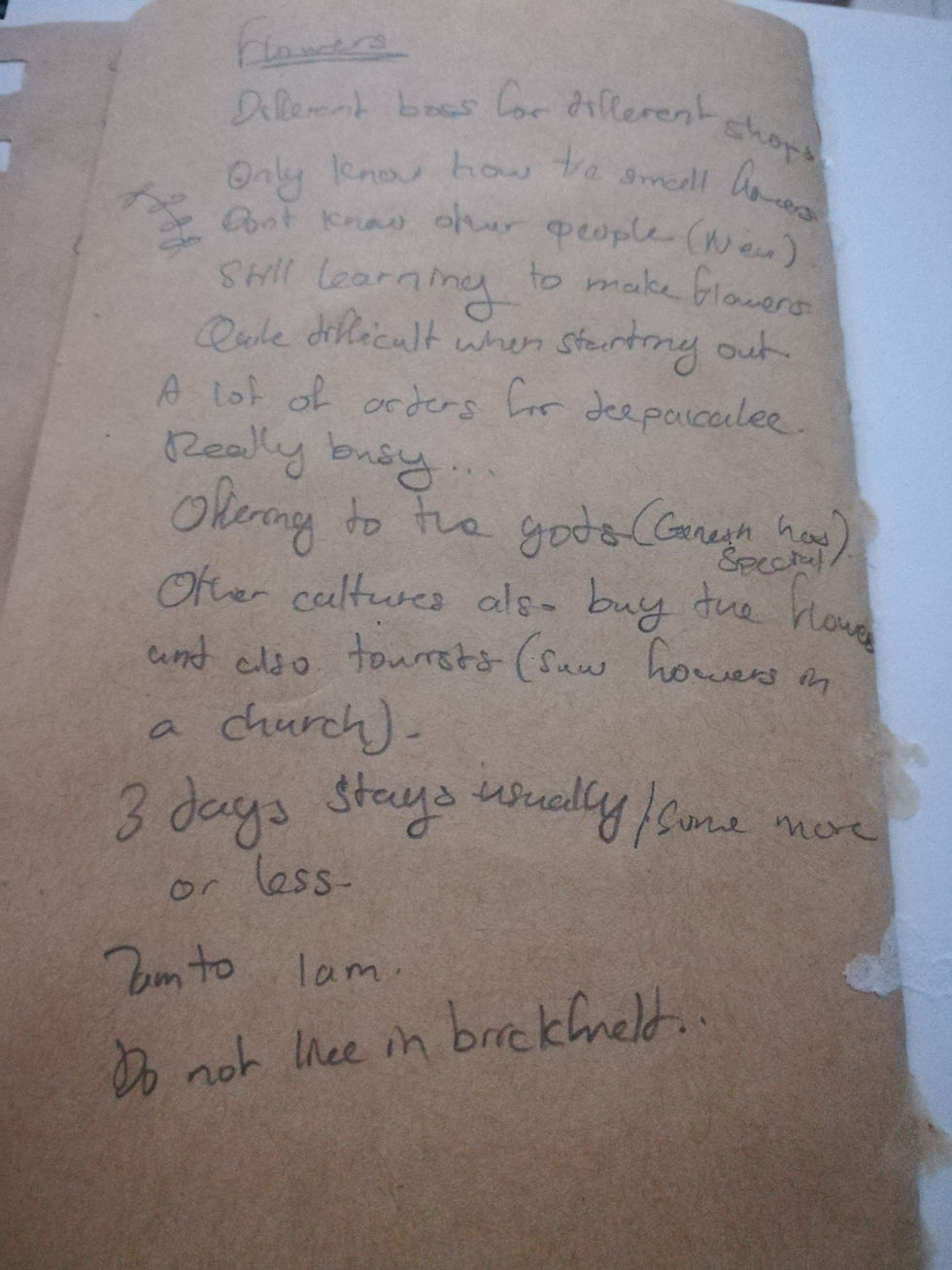
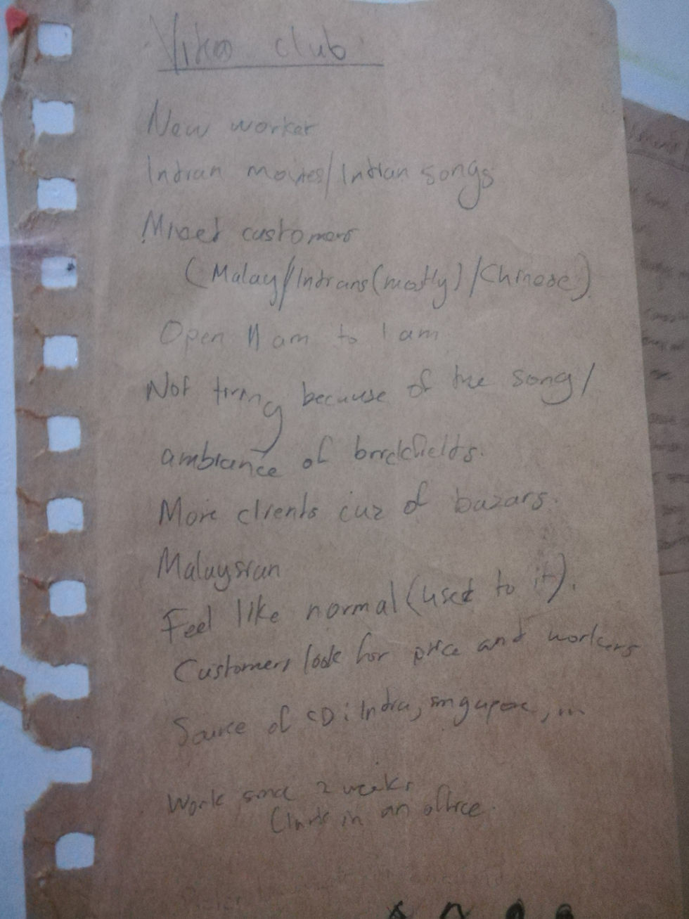
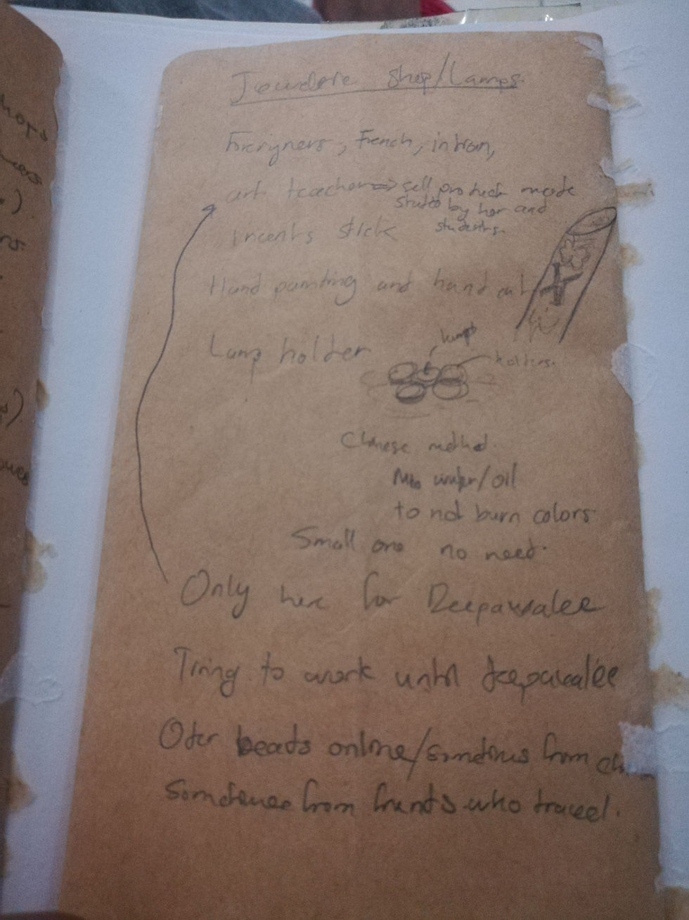
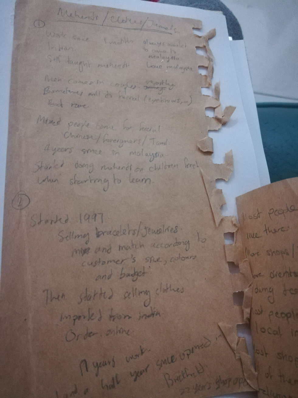
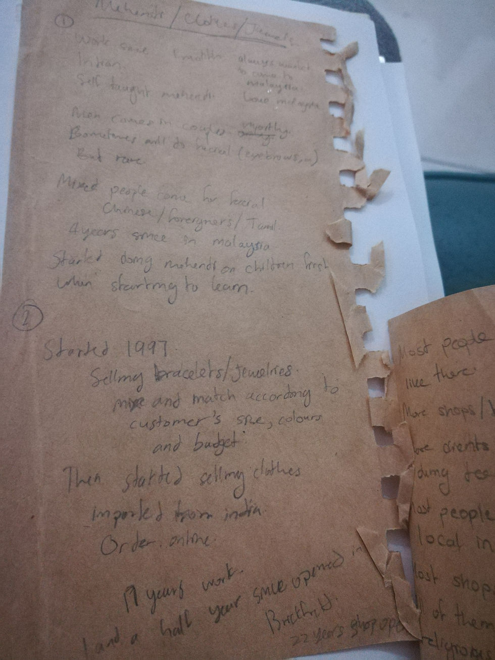
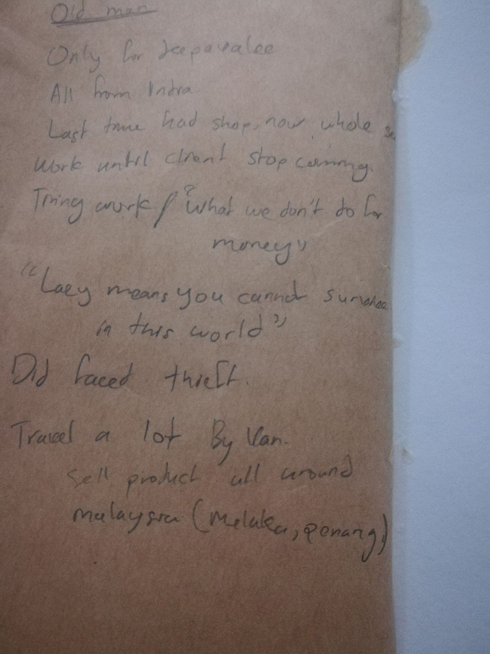
Among all of that there were many useless information that I noted just out of the blank but there were some connections between each of them which I wrote in the conclusion.
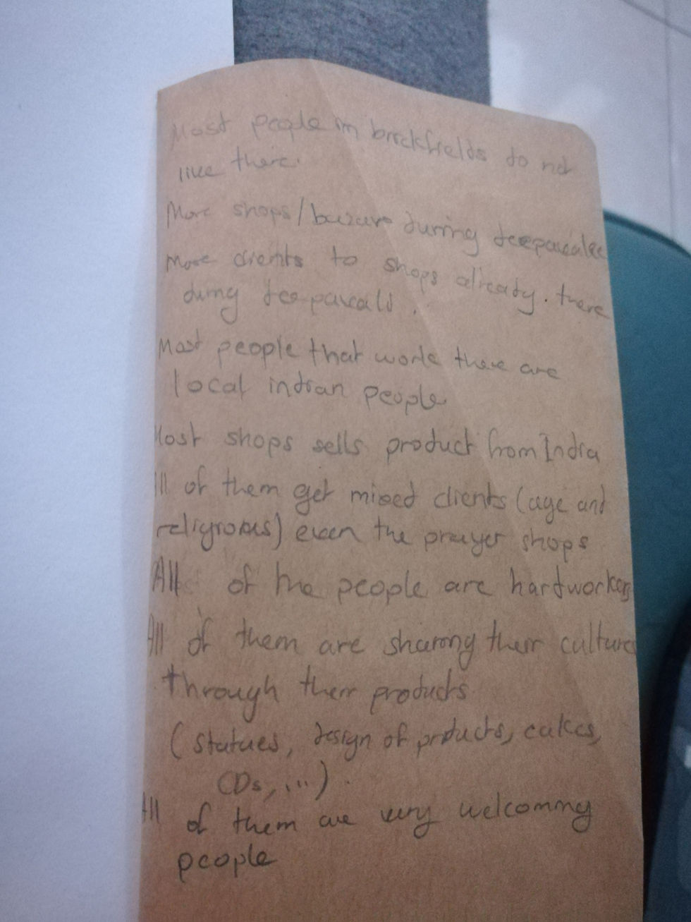
So here's the similarities that I found between all of them but the one that got my attention more was how hard working all of them were. Some of them work from 6am to 1am sometimes, Some pays a very expensive rent for a small space but they will keep on working because they need that shop to survive. This really caught my attention because they were all very smiling and welcoming towards me when I was talking to them. So I decided to based my project on that, their courage.
So now again I was back in the blank and didn't knew what to do. During tutorial my lecturer told me to "just do something" so I did it and BAM!!! that was a very good advice haha.
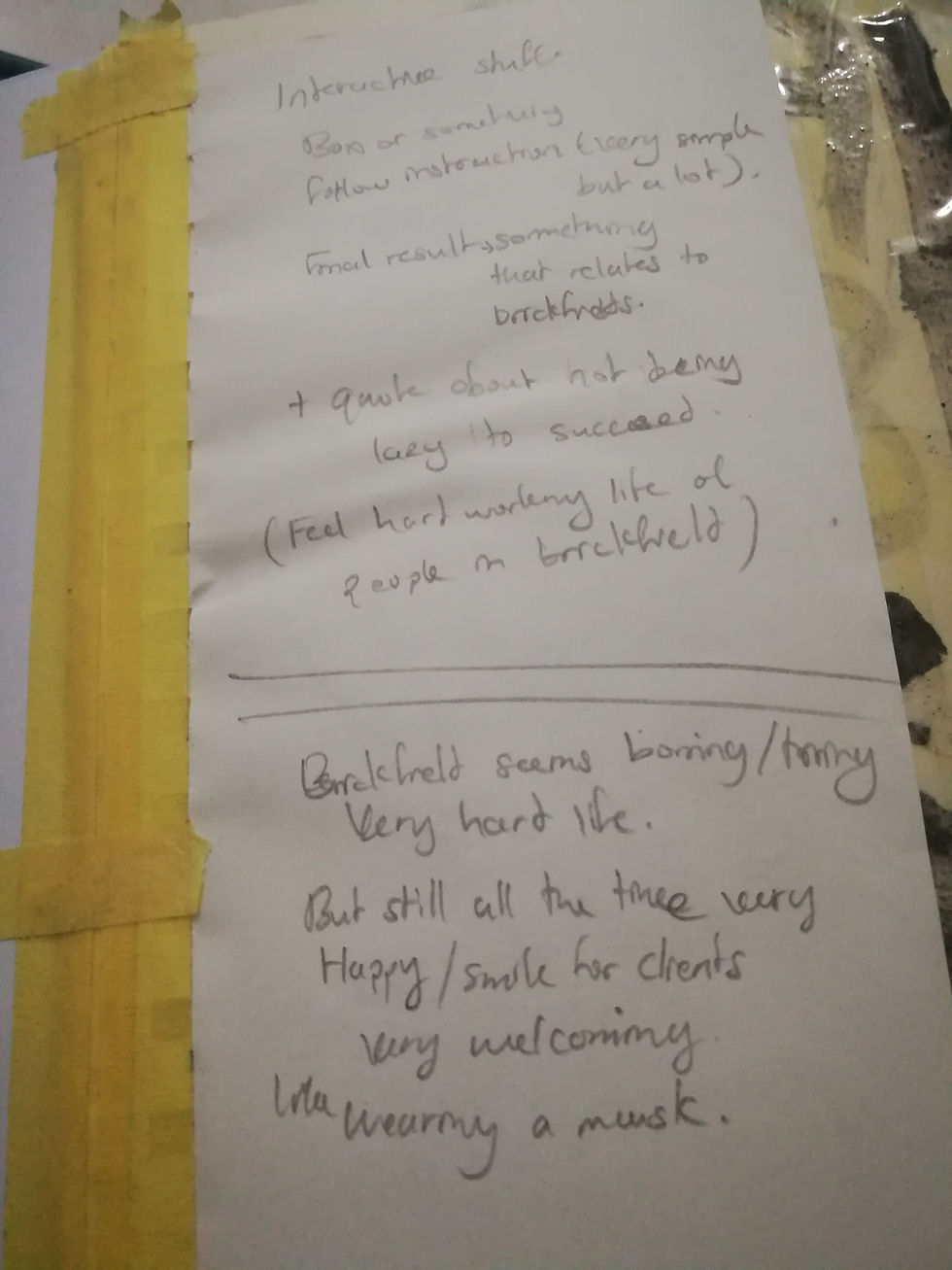
I noted down a few Ideas that I've got but while "doing" I found even better Ideas.
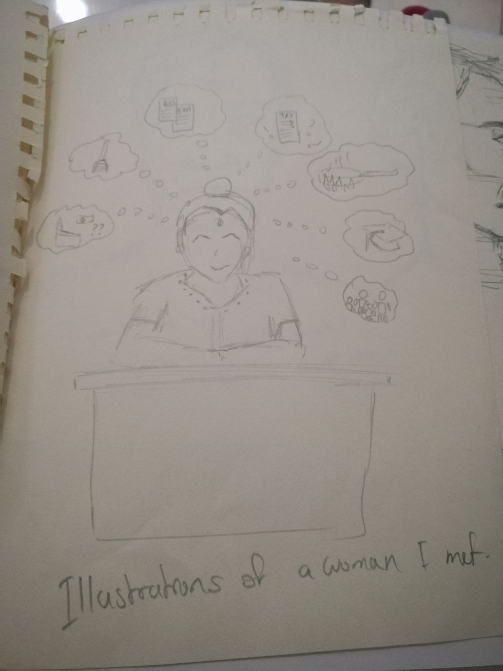
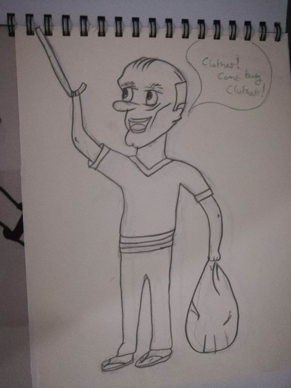
So I made 2 illustrations because I love doing that, I made one of a woman that was very nice and smiling but when I talked to her she seems to have stress about her rental, her children's education, ect ect. the other one is an old man who travel everywhere around Malaysia for trade and was selling his clothes in Brickfields.
Based on the first lady I've got the Idea to make a clock based on her life to show how hard her life is but still she smiles while working.
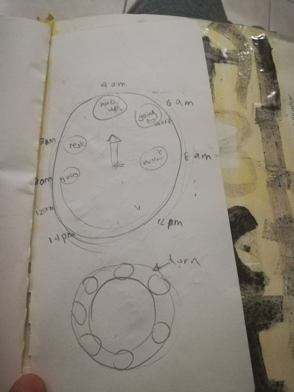
The idea would be in the form of a clock so it would be interactive and at this point it was not much elaborated.
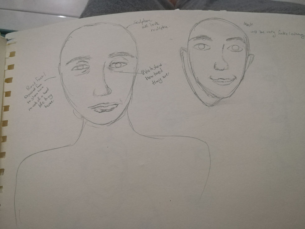
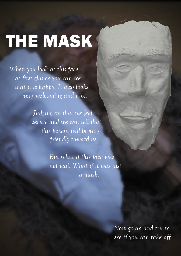
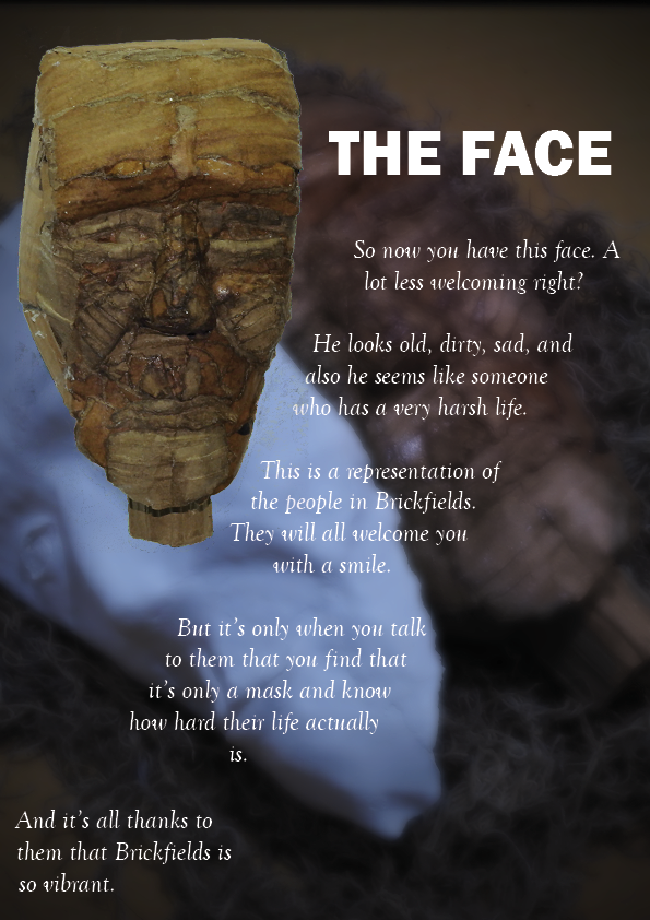
Then after thinking some more I realized that it was like they had a mask on so the face that they were showing was a mask that they use to work but when you look behind it you will see their real face that is very tiring and bad.
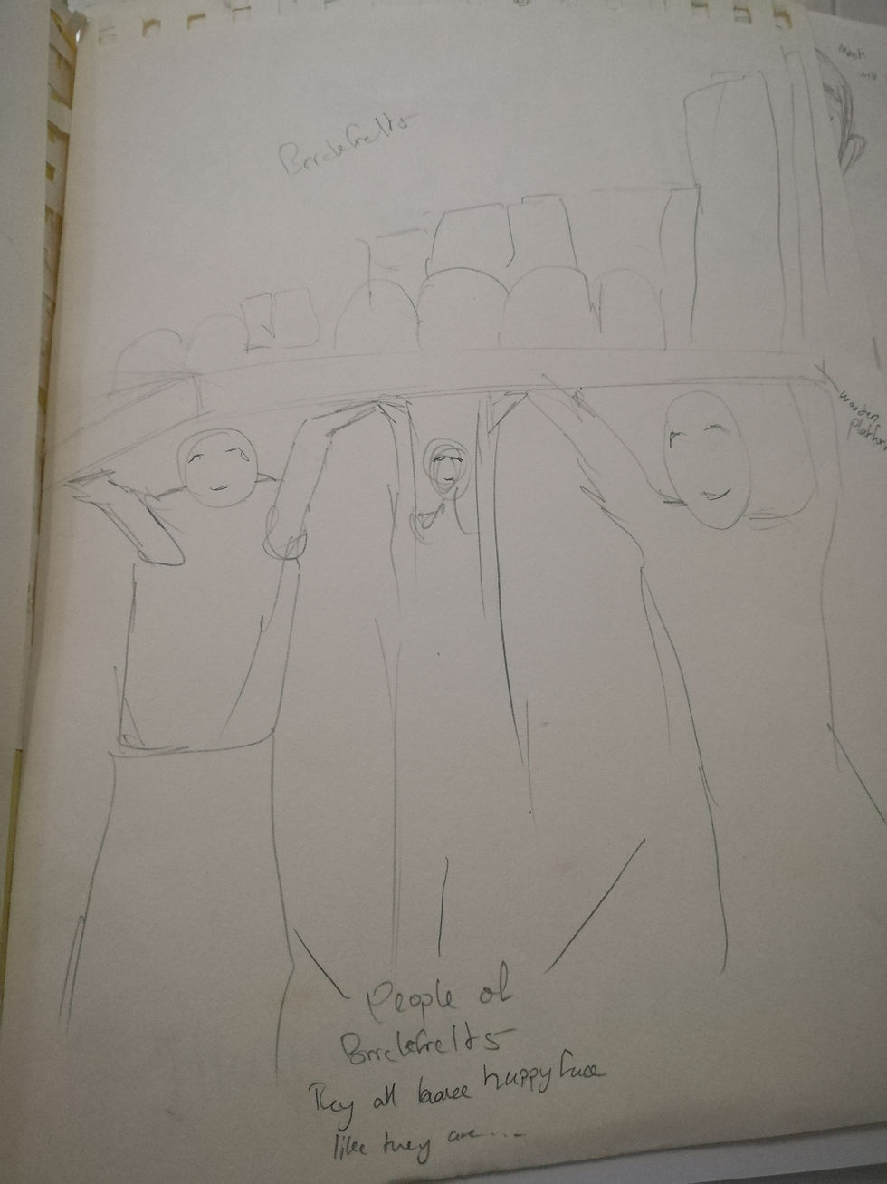
Another thing that I've thought of was that the people in Brickfields are what makes Brickfields beauty and creates it's vibes but still they have a very tough time doing so. So I made this sketch that illustrates that, the people of Brickfields are holding it with all their strength and you will be able to see like if they are having a hard time doing it but still they are very smiling. This idea I was thinking of doing it as a sculpture.
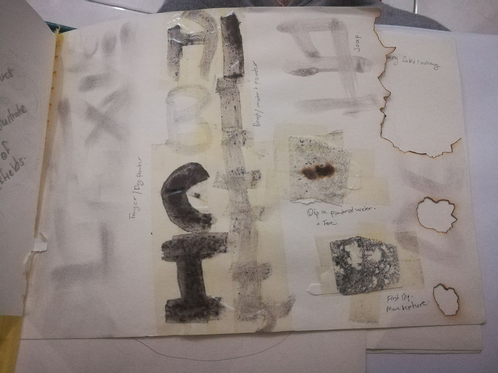
Besides this I also tried to do some exploration with some firecrackers powder because I was thinking that the rough texture of it was interesting to demonstrate the hard life of these people. I also had an idea of doing a portrait of a smiling person and burning it so that the fire will represent the hard life of these people but I actually didn't got the time to do so.


The fun part now... The Idea that I've got which was making a clock with the illustration of the lady I met I tried to do it on a bigger scale and make it sculptures instead. So I went on learning how to use clay haha.


So basically that's how it works. When you'll slide the pictures you'll find her dead sleeping, then brushing her teeth still sleepy, then in the train still a bad face but when she works she smiles then back again into the train and then cooking still with a bad face and then the whole thing repeats again.
For a first trial it was quite good but there was so many tiny pieces so the audience might get lost with the meaning of it. So decided to try the mask Idea.
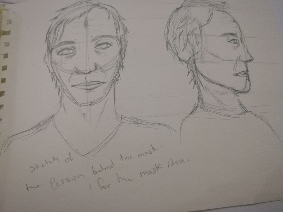
I made a really quick sketch of a person that looks bad and tired which I actually didn't used at all for my Face sculpture, I don't know why I sketched it and put it in front of me while sculpting because the face I did became something completely different haha. But it actually helped me to sculpt the tired and bad face though.
The material I chose was cardboard for this sculpture because I found some cool examples on google and It seemed like it would help me get a very rough texture to illustrate the hard life of these people. I also chose cardboard because there were many unused one where I am living so yeahh good material.
So I made some researches and watched some videos how to sculpt cardboard and then I just jumped into it.


At first I made a foundation of the face


After that I sculpted the face on it. At first I was trying just using dry cardboard that I teared but it was hard to give it it's shape properly so I had to work with it like paper mache, dip the pieces of cardboard in water then add glue and sculpt. I also teared the cardboard into sheets and used the corrugated part to create a rough texture on the cheeks because emotions has a big impact on your cheeks when you cry or smile and stuffs so yeah.


So I tried to make the mask afterward and this is my failure. what I tried to do was make it out of paper sheets that has been dip into water and glue and let it dried. I wanted to use paper sheets because it would create a very smooth surface but the paper sheets was hard to sculpt and was tearing so yeah... failllluureee...
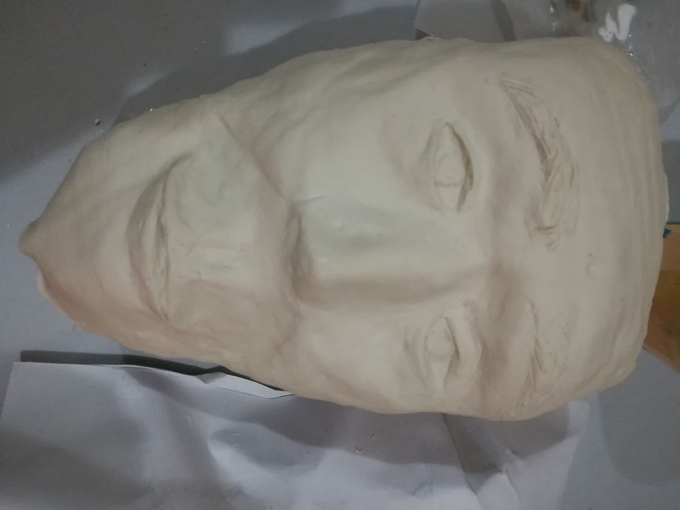
But then I did it with clay because I was pretty comfortable with it and indeed I've gotten a very great result. However the only thing that I wasn't very satisfied with was that the texture wasn't that smooth but well whatever, It looks great, it has a smile and it's pretty smooth so that's fine.
After showing my progress to my lecturer she told me that I could go with it but now I had to find a way to display it that will pass the message better and that will make my work more of a design work rather than an art and craft work.
Guess what, I was back in the blank again haha. So my lecturer told me to look at some artworks and there was a particular one that got me inspired, Memory Palace.
So my Idea was to make an arrangement by putting the face and the mask on a table and the audience will be able to put on the mask and remove it, and also I wanted to hang posters explaining about the face and the mask and have a background covering the whole thing.
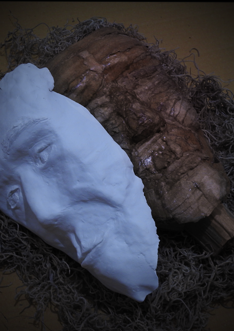
So I made this photograph to use as the background. The straw underneath was supposed to relate to the hard life of the people of Brickfields and you can also see that the mask looks very odd in the arrangement here as it's a cold colour and this is because it's fake.
I used this to create these 2 posters with InDesign
And I also tried to create my arrangement with photoshop to present to my lecturer
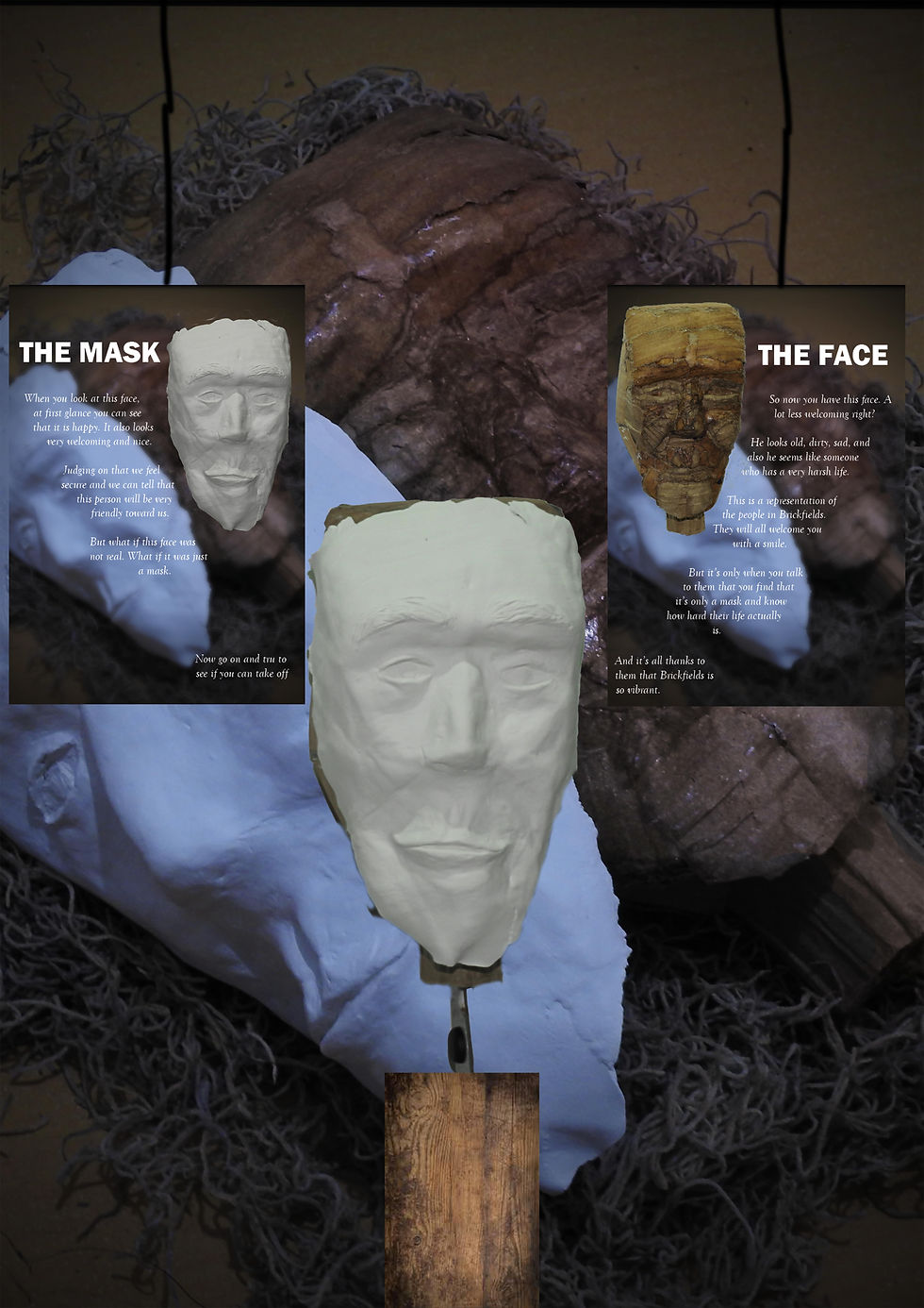
But after looking at it carefully I realised that the face and the mask was a little bit too repetitive so I made a few different ones.


And then I made these 2 also which is basically the surface of wood and the surface of cardboard.
After I showed it to my lecturer she told me that the background in the poster was still too repetitive and that I don't need it. And also for the background of the whole composition I needed a background that relates to the story and that it can be textures or abstract or wordings. And she also told me to hand the mask also so that it doesn't gets damaged during the exposition.
So this times instead of getting lost in the blank again I actually was able to do some stuffs HAHA, lesson learned.


So here's my trials, I concentrated more on textures because it was what I could play more with to create their hard life. I also tried some wordings in some textures too as you can see.


So here's my trials for arranging them on photoshop. After that I chose the 4th one because it was more aesthetic.
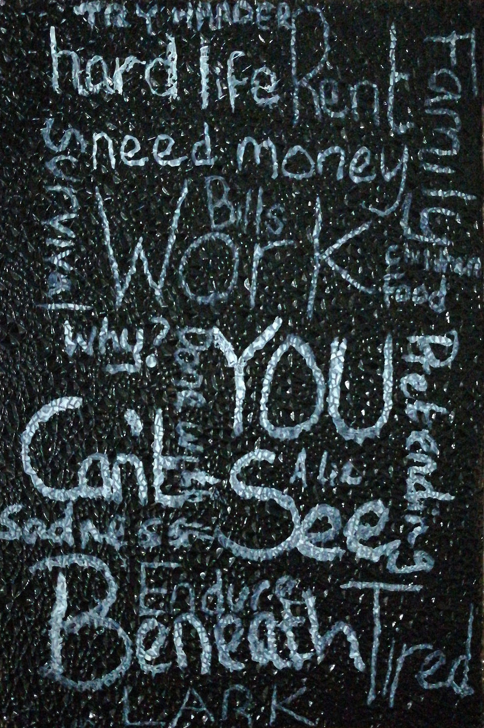
So I took a picture of the background, edited it lightly on photoshop and then vectorised it on illustrator so that it doesn't looks too rough and badly edited when printed. Now let me explain the background a little bit, it's has a hard texture that relates to a harsh life and the wordings are things that you feel while being behind a mask or things that you just feel when you're tired and in stress. The whole composition is really dark and you can also see some cold colors that creates an uneasy feeling when you look at it. The texture and the lettering style also emphasize the uneasy feeling.
As for the posters I decided to print on a transparent paper as it would look bad if it was just on white paper and cutting the background.
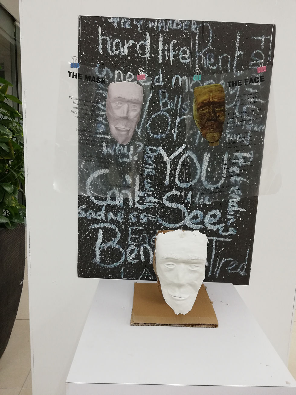
So here's the exhibition.
The things that I didn't really like about it is that I couldn't get the background on A0 so that I covers the whole area where the posters are hanging. And also the I didn't get enough time to experiment on the transparent paper and what I could do so that the wording will be more visible. In my panic and lack of time I rushed it a little bit and ignored that detailed and this became a huge mistake I made.
But overall i'm pretty satisfied with it. because it looks nice and the message is pretty straight.
This is my video for this project
And here's my video for my sketchbook.
So in the end Design Process really helped me gain a lot of confidence and I've learn a lot of different techniques to use that I can mix together to get a cool effect. I've also learnt how to find connections between things and using that to come to a conclusion. I've also learnt how to put things in contex with other things. I also learnt my secret talent in sculpting haha. But what I can improve is my time management and my research and exploration skills.


Comments