
Image & Type Brief
- j19031193
- Nov 28, 2019
- 8 min read
Image Brief


So for my Image brief I decided to based it on my journey to Brickfields. when I went there it was a real contrast from where I am living which is Subang Jaya. Brickfields was like the Indian part of Malaysia. No wonder why they call it Little India. Brickfields was very colourful and there was a nice party kind of vibe to it. It seemed like THE perfect place to get inspiration and indeed it was.
I started my research by sketching things that caught my attention
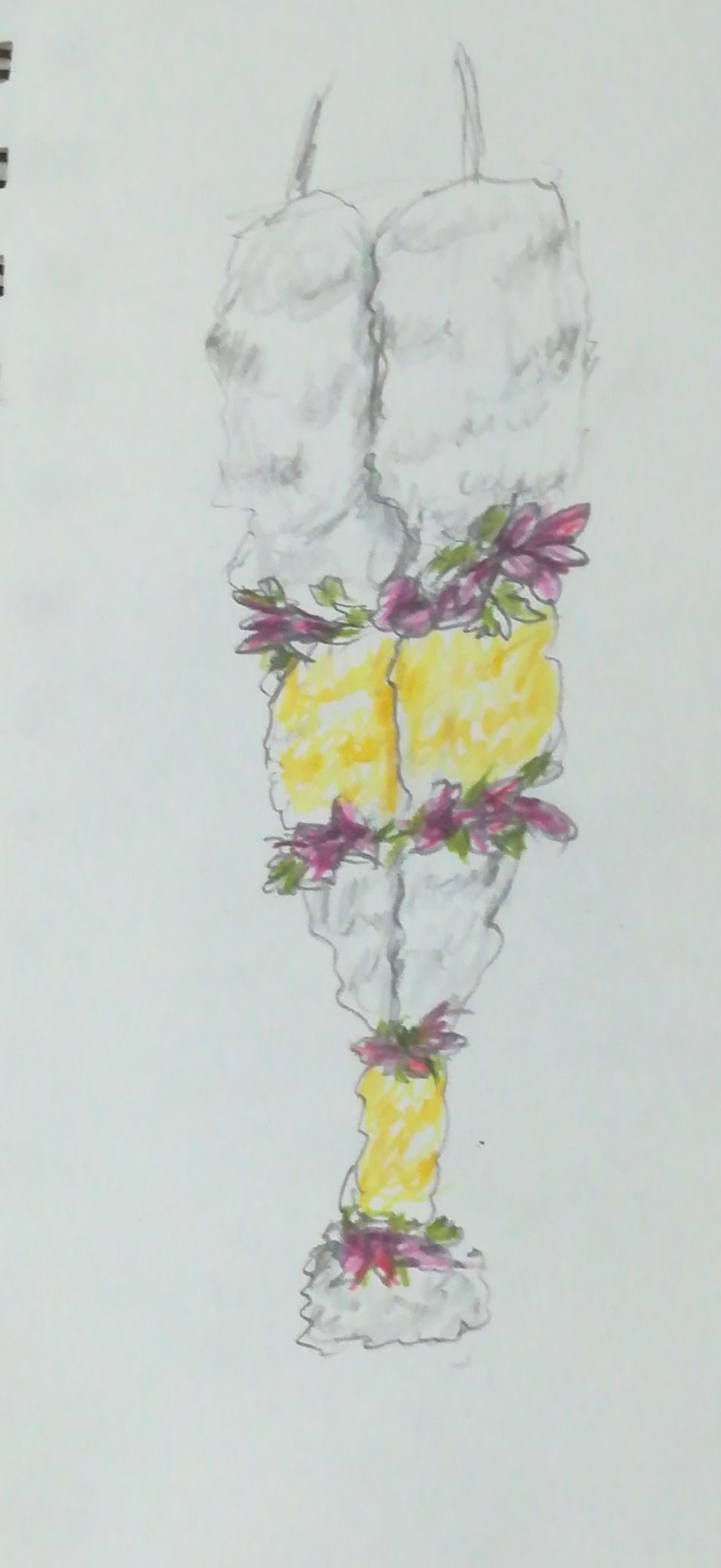
First there were the garlands that they were selling at some sort of a market. It was very interesting how they were selling these and the way they displayed it
This is my sketch of the flower market which I was able to capture in a very interesting perspective. the sketch is rough but you can see how they displayed the flowers and how the place was grungy and old somehow but still well displayed and not ugly.

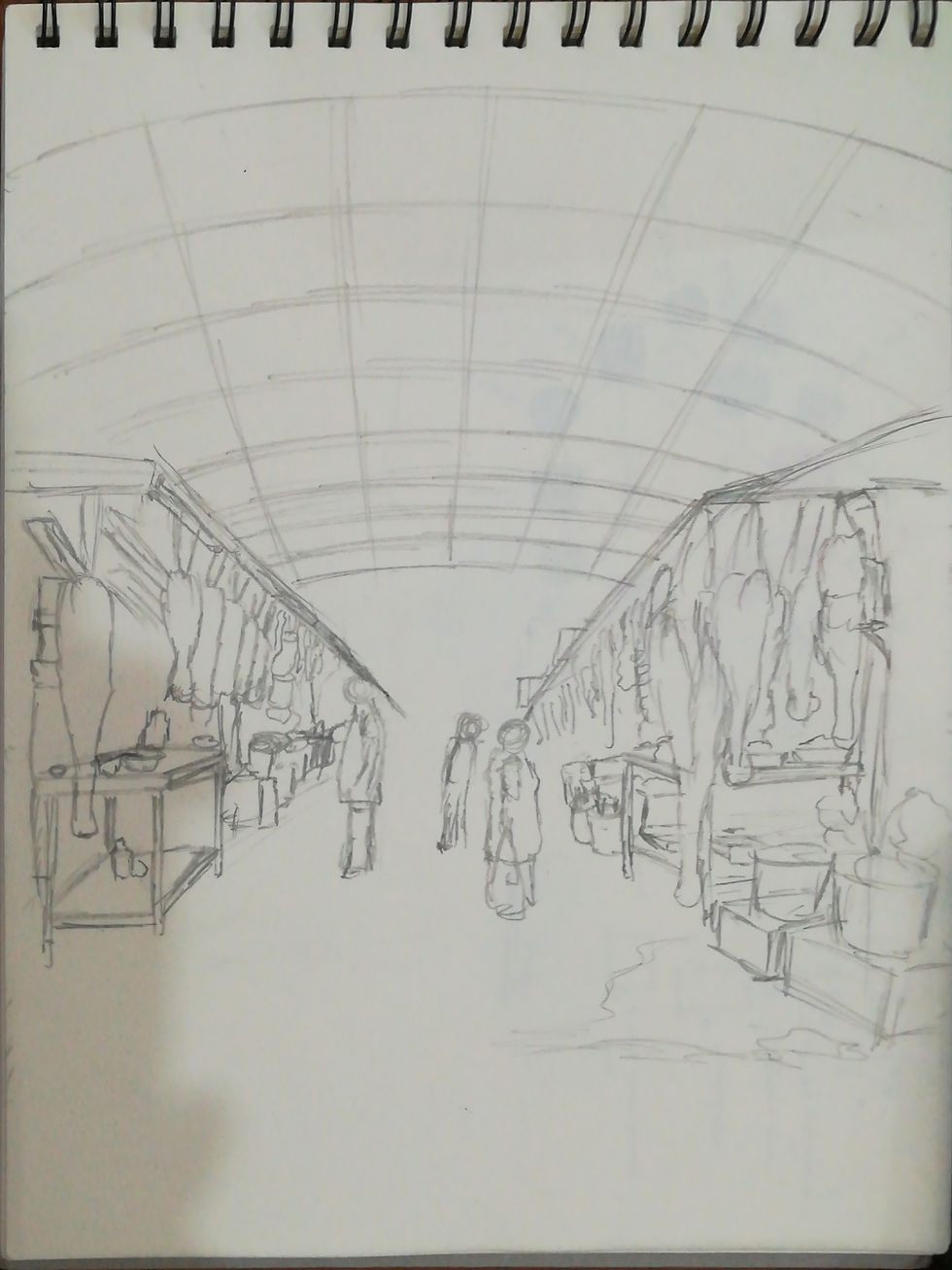
While walking back to the station I was totally hit by this scene that I had to draw.. Brickfields is actually found in the middle of the city so there huge buildings all around it but only in the area of Brickfields where they call Little India, there's small shops and Indian pillars which are very well decorated. When I googled Brickfields before going there, I didn't saw any pictures of the huge buildings surrounding it. When I saw this scene I knew I could build a story just with that.
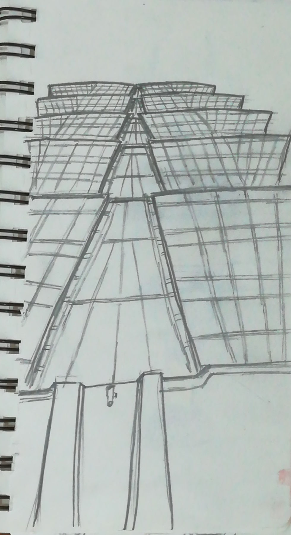
Later on the road there was this building which looked very modern and had a nice design with it. and it was just few mins of walk from Little India. As from there I also tried to feel the difference between being in Little India and being near those huge buildings. What I've noticed was that around the huge building you feel a little bit more stressed like if when you are there you have to be a little bit more formal in the way you interact with your environment but in Little India you feel like letting go and just be yourself. You feel a little bit more relaxed because of the vibe in Little India.
So as from there with that scene that hit me just above and that feeling that I've got, I already got the idea to make like a 2 world connecting story. I was thinking of making like a portal or something that will bring you to a magical world far from your hectic life that will help you relax. But it was really brief and not well elaborated at that point.
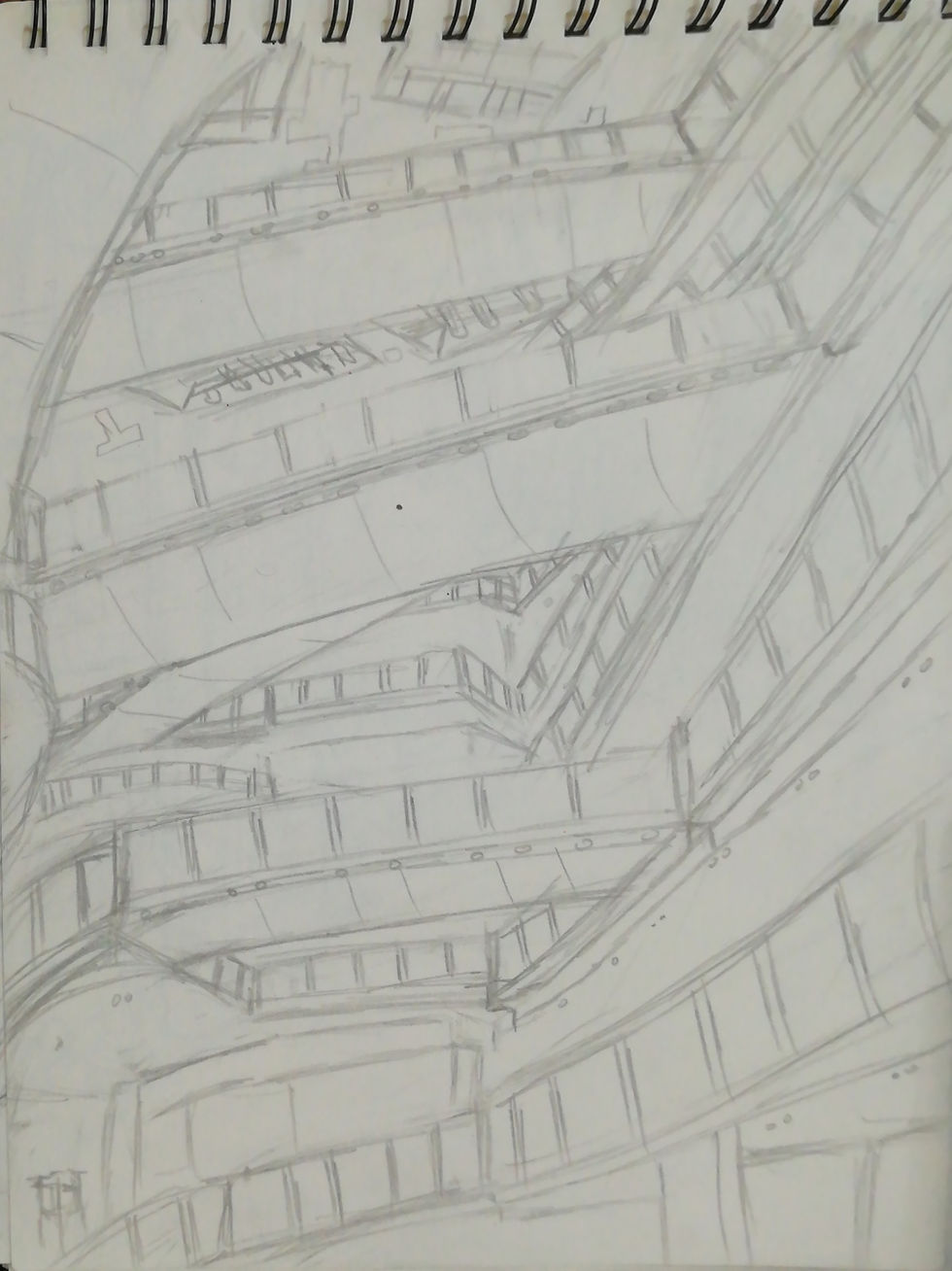
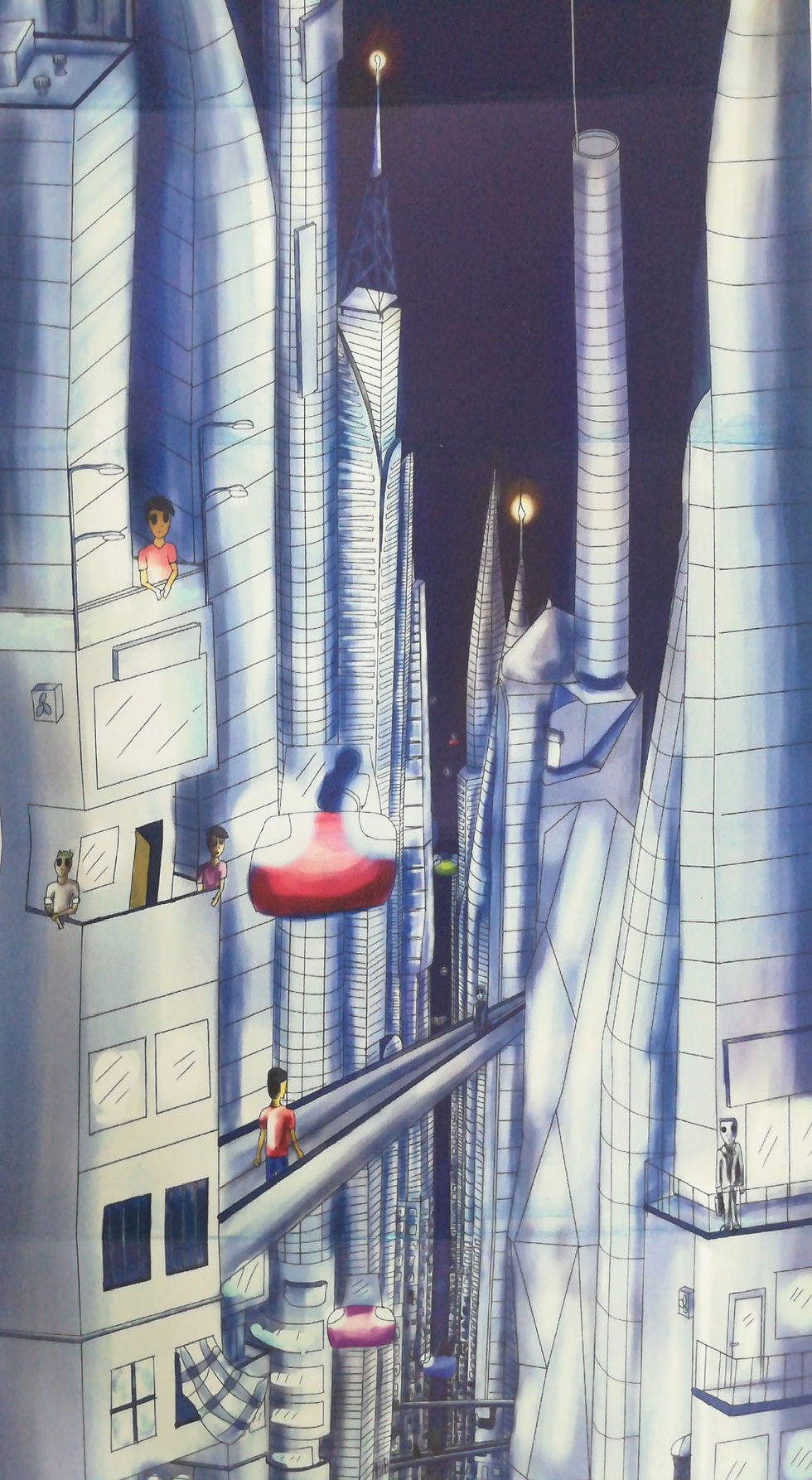
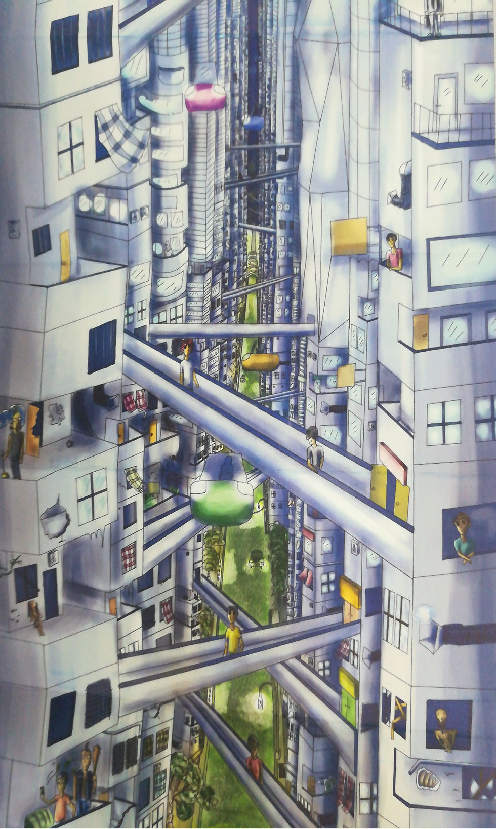
Then while going back to the station I found this scene in a mall that was connected to the station. There were all this bridges inside and it was very high. So that gave me another idea to make my world based on the hierarchy between the rich and the poor. So from then the world has become a world with very high buildings and on the highest building the rich people live and on the middle part is for the average people and then you get the very bad dangerous part where there are gangs and homeless deprived people but then at the very bottom it's like a completely different world. People are more down to earth and happy and nice, they live connected to nature and they sells flowers and handcrafted bracelets and necklaces made from natural resources.

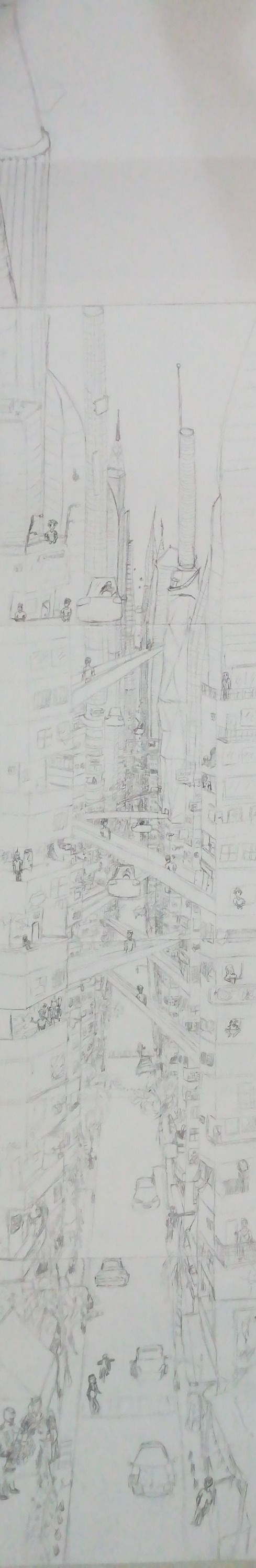
So this is my first trial for drawing the world. here it's the part for the rich and the average people also and the down part is for the poorer, but it's a really quick sketch that I tried to include all in an A4 piece of paper so it's really rough.also you can see that I added flying cars and all that to make it more futuristic kind of. at the very bottom in the middle of the page there is like an alley, this is where the people who are connected to nature lives.
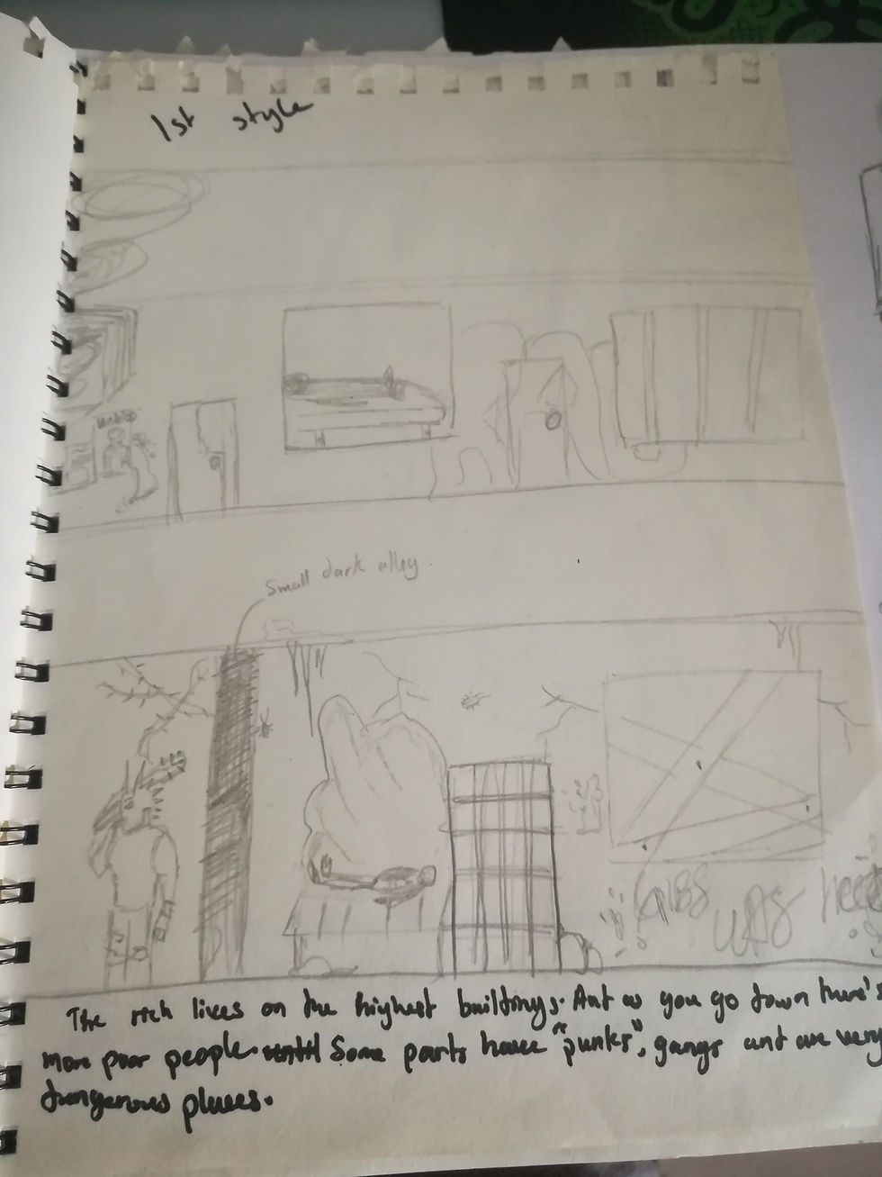
So this is my second Sketch for the wold it's the part where you have gangs and homeless people, the really grungy part.

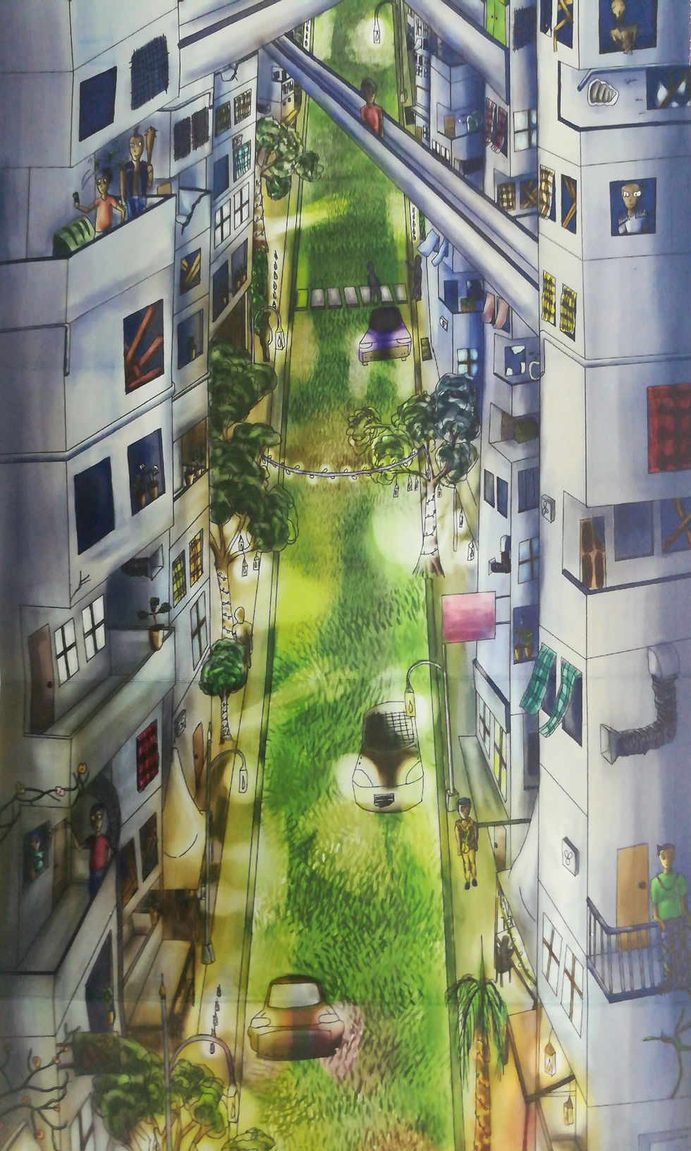
And finally this is the very bottom part which if you have not notice is inspired from the market place is Brickfields and it's in the same perspective also. The cars also are sports cars because when you live in a very modern world where there are flying cars, I think sport cars will become very affordable so yeahh. You can also see that there are a lot of light kind of Diwali lights on the road. This is how this place gets it's special vibe that makes it colourful like Brickfields.
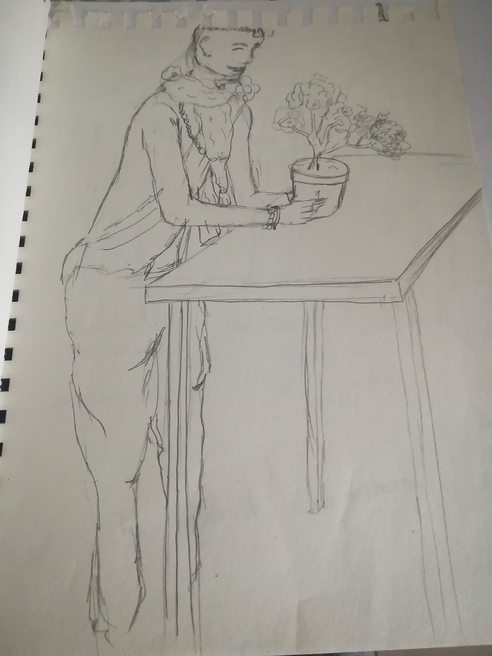
After that I wanted to sketch one of the people that live at the very bottom and I sketched this really nice scene of this person who is dressed a little bit like the Indian priests and has the flower garlands around his neck and also few handmade bracelets and necklace and is selling some plants. They gain their lives by selling these actually.
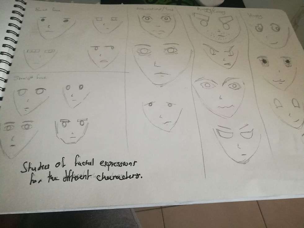
Here I made different studies of different faces and different expressions that I could use in my story
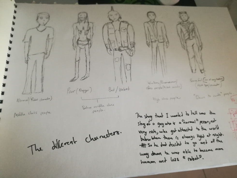
And here I have the different kind of characters that will be included in my story.
The first one is the main character actually and he is an average person who is numb of expression because society took that all away from him and he became just a robot in this modern age, he is just like all average person.
Next to him is a very poor person who has literally nothing and is thin as hell because he has not eaten properly for ages and you can see hair is really messy and bad.
Then we have that punk dude who is also someone poor but he is someone who is still striving for a life in this modern world so he became bad and violent so that he can still live.
Then next to him is one of a kind, the kind of person who is no more human and is just robotic because the hectic live took all his humanity away from him. You don't always see these person often because they live in the rich area which is huge huge buildings that normal people don't get to go to.
And lastly we have the one who are connected to nature and are very happy and nice.
So after having all this down I tried to elaborate the story a little bit more and I made the story about the average guy that was mentioned before who got attracted by the lights of the people who lives at the very bottom and wanted to go there, so he made his journey and met the different kind of person in this modern world and once he reached the very bottom the vibe that he got and the scent of nature made him human again then you can see his dull eyes turning normal.
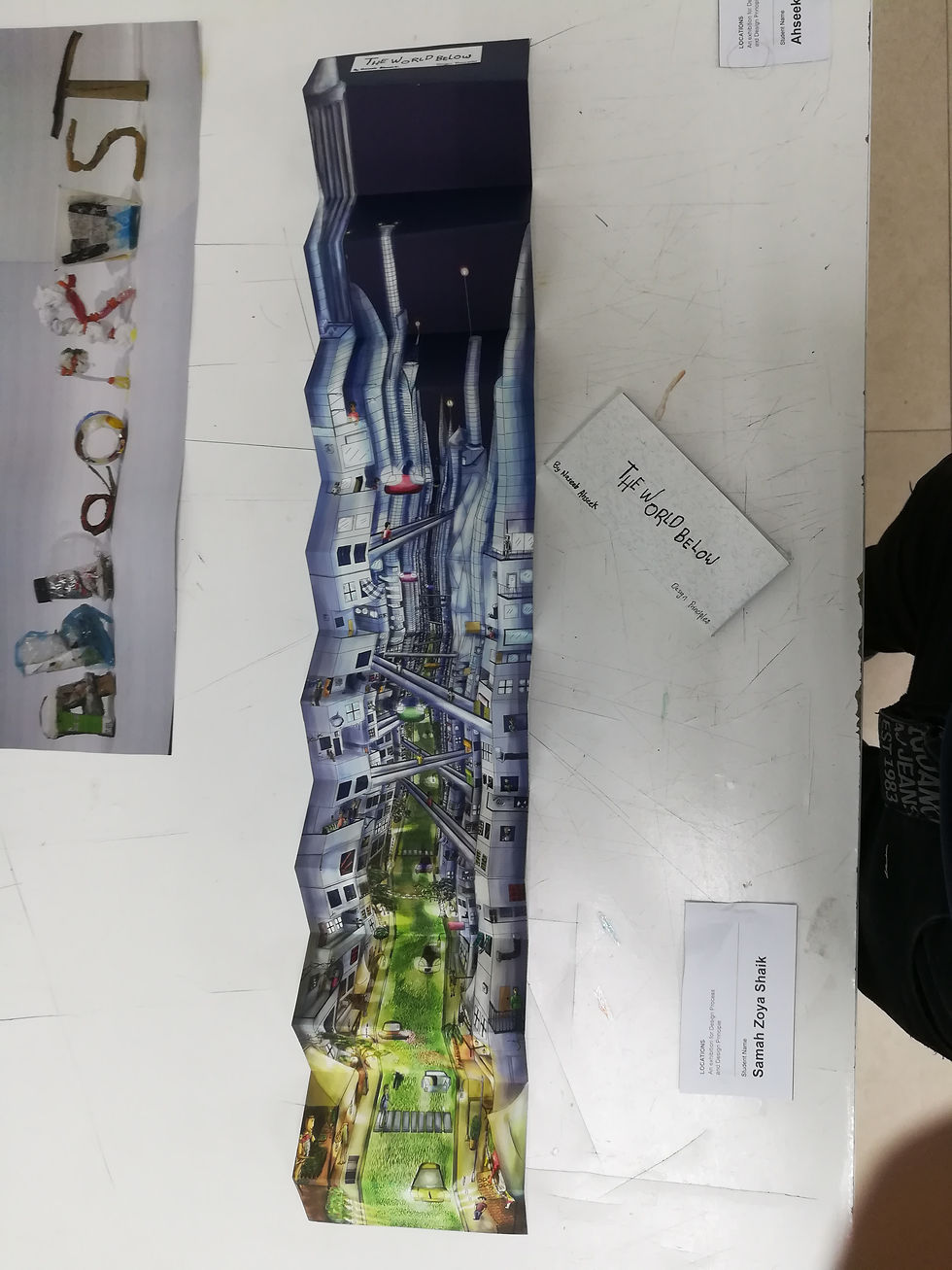
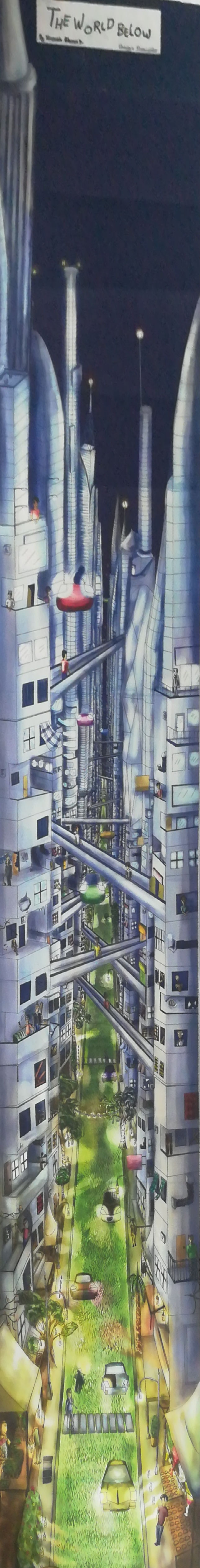
So after showing all this work to my lecturer during one tutorial, she proposed me to make it as a huge accordion fold based on the perspective scene that I sketched above that I can continue till I reached the very top of the world. And she also told me that my world was very well elaborated so I can make it more about the world and include some elements of the story which is hidden in the whole scene.
So I experimented a little bit and I tried to make 2 types of the whole story both in accordion fold.

So this is the 2 different types of sketches that I came up with, sorry for the bad quality of the images here, it was too long to capture properly. So yeah when one was the perspective drawing that the lecturer recommended me and the other was a straight view of 1 building that tells the story and that contains elements of the world. It was basically my backup plan in case I failed the perspective view because I thought I sucked at perspective haha.
Well it turn out that the straight view didn't contain much element of the world and I was not very satisfied with it. It's only strength was that is was easier to make and was telling the story well. So I decided to go with the perspective view instead.
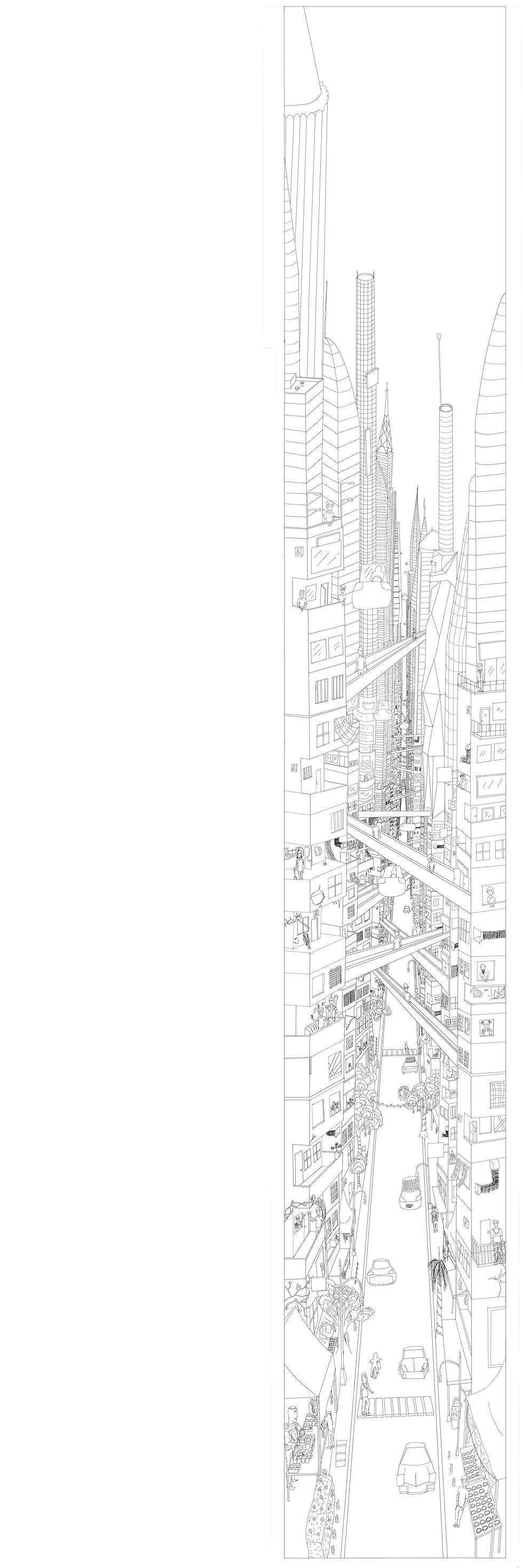
Here's a little bit of my process, I decided to use the greyscale method because I was not very sure of the colors to use and how I will make the glow of the lights in the bottom part.
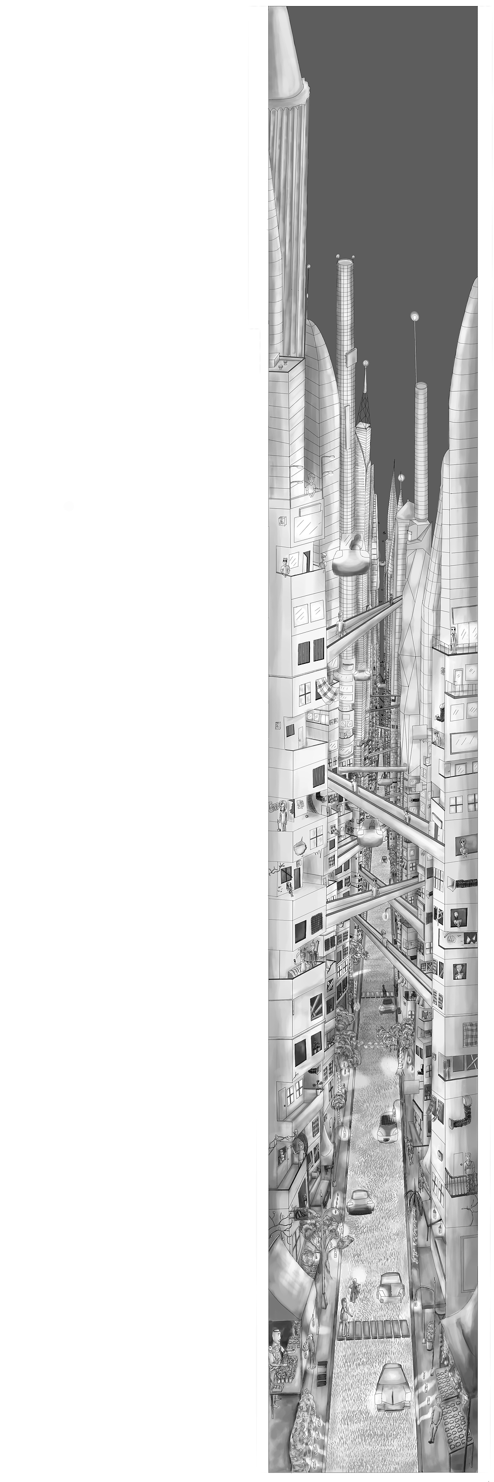
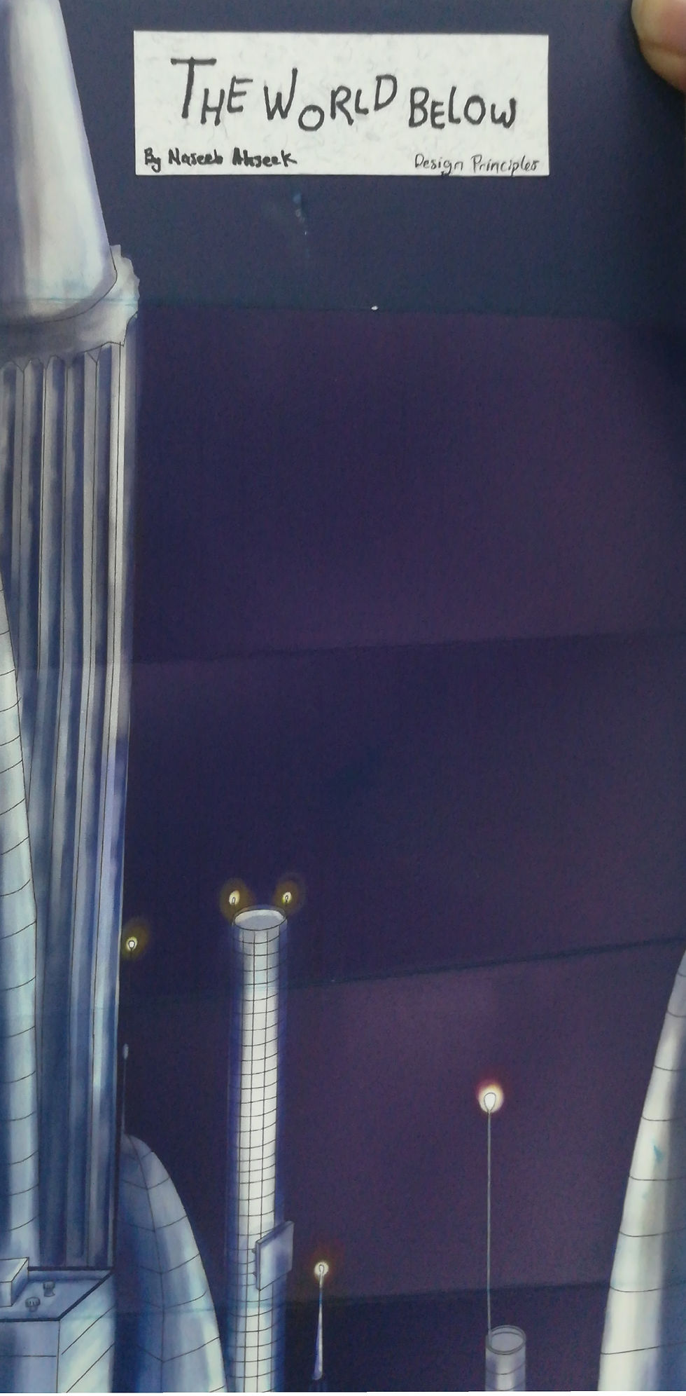
So after making it black and white I used an overlay layer plus a colour layer and lastly a high light layer and here is my final outcome.
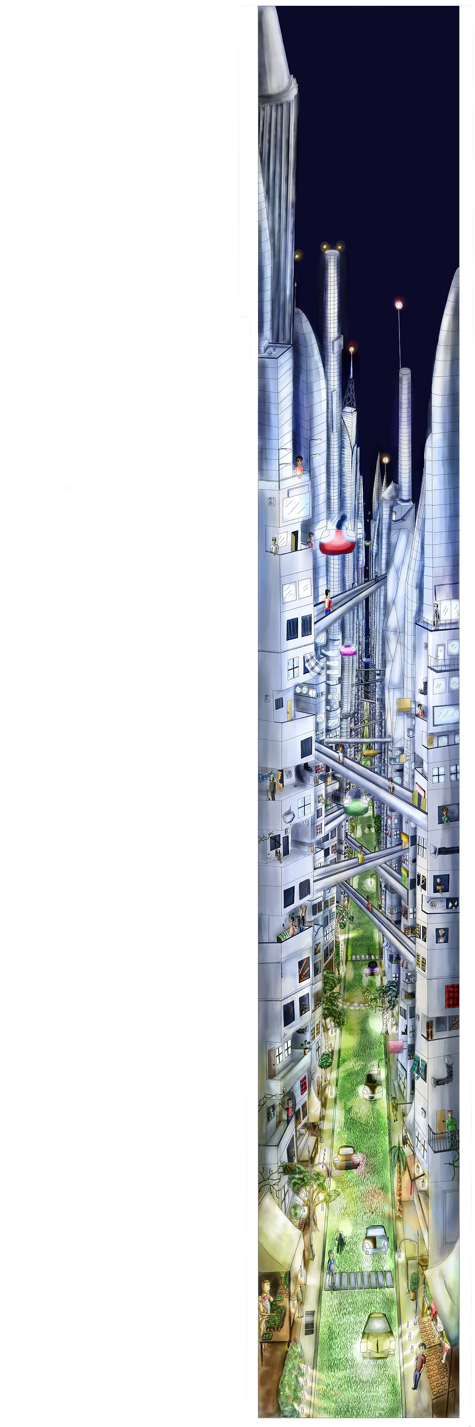
As you might have noticed I have used warmer colors on the bottom part and as you go higher there's more cold colors. And if you follow the guy in red shirt you can actually see the story. You can see him being numb at first and then suddenly got attracted by the colors and then going down, getting bullied by a punk for money and at the very bottom his eyes became more human and he was smiling.
This took me a long time to complete just because of the very tiny details, it's also the project that I spent more time on but I got very satisfied with the final outcome because I've never done something this big digitally before.

.
However when I printed it the printer printed it small and it was quite expensive also the printing so I couldn't really afford printing it twice. I also spent lot of money on the other projects and this made a huge impact on my budget so just to go with the flow I decided to make it a pocket book.

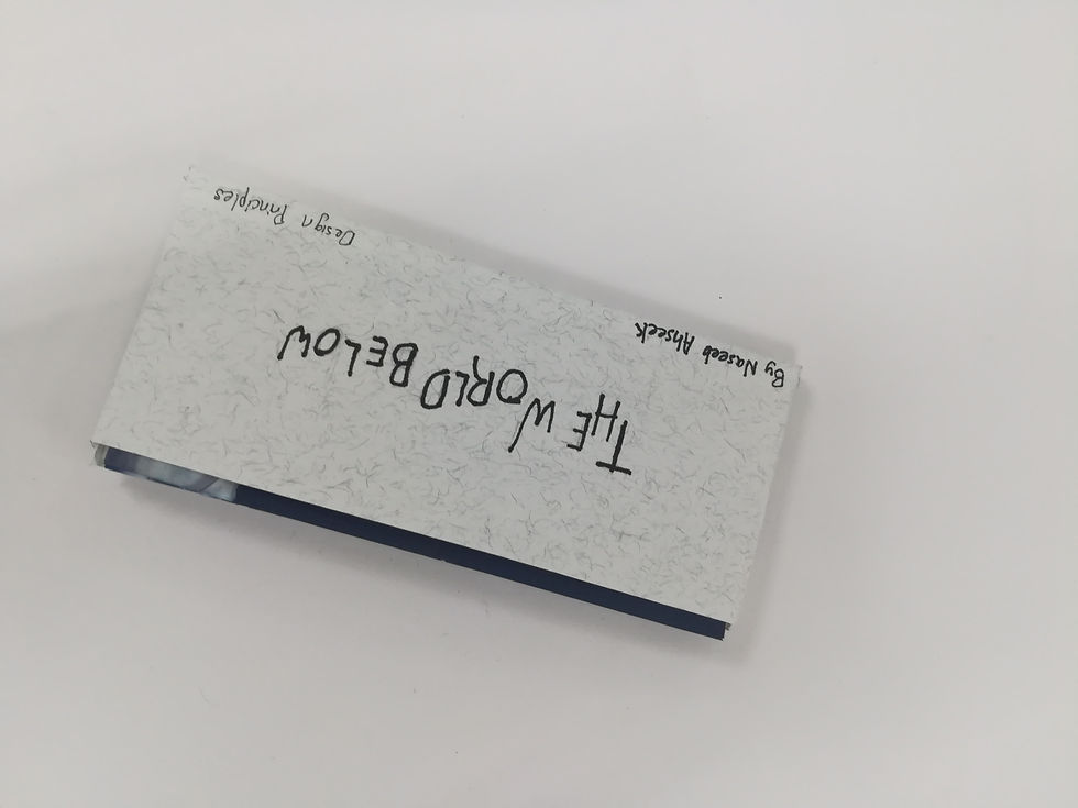
Because it was an accordion fold, It was not folding well in place when folded so I made a small pocket for it. The title I chose was "The World Below" because it's what the story is about, a world at the very bottom of a modern world and society. It was handwritten because I wanted it to have a "comic" style with it because this fits well with my illustration style. The paper I used for the pocket has this nice texture with it which brings out the handwritten title and matches well with the image book because of it's bluish tint.

Here are few more pictures of the final printed product...
Type Brief
For my Type brief, change of location, I wanted to base it on SS15 Subang Jaya which is where I live. And the reason for that is because of all the trash that I see when walking from where I live to INTI. And also this bad odor all around the place which bothers me a lot when I first came here.
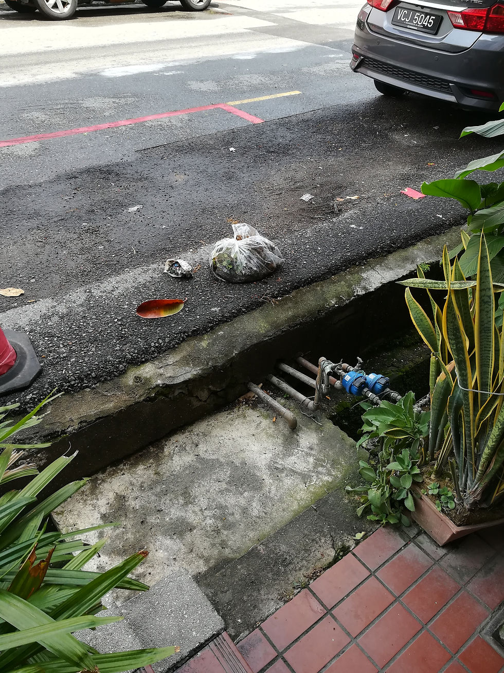
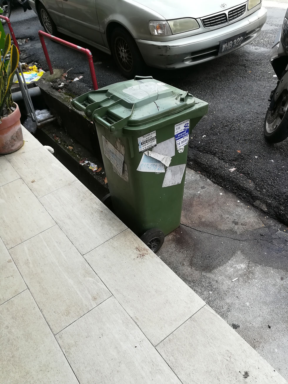
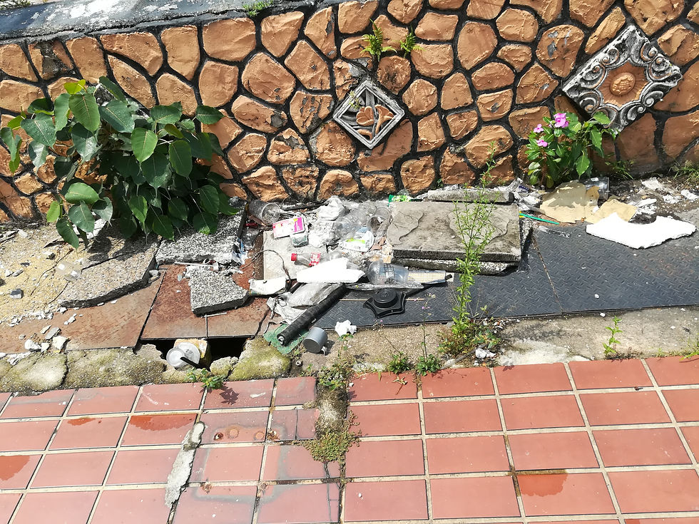
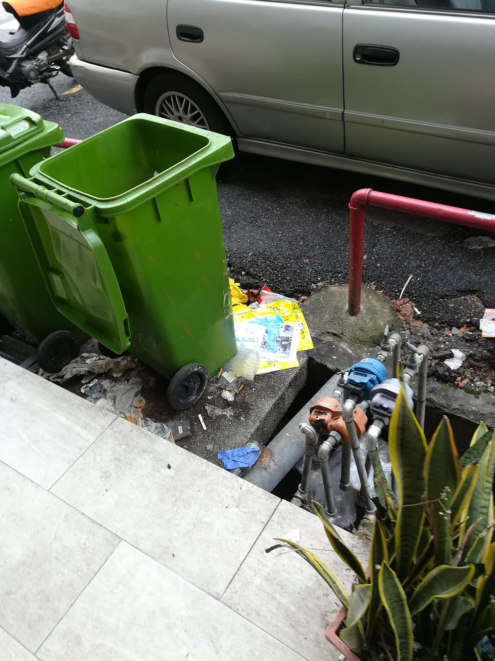

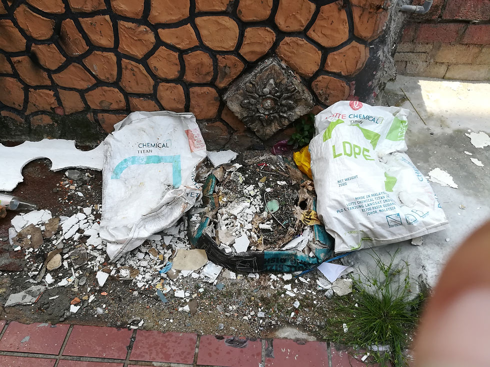
Here's a few pictures of the trash.
So as from here I wanted to make a sort of sensitization to tell people not to throw their trash everywhere like this or drive people's attention to how dirty SS15 is and that they can stop that by easy means but the idea was still rough at this point.

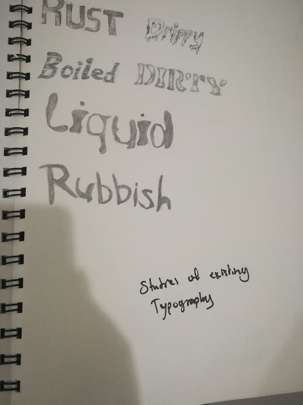
So here's some research I made on words that I could use for my typography. At this point I wanted to make something about "reusing" things that you are going to throw whether by changing the use of it or use it as material for something else. In all the words that I found none really had a the same meaning as "reused" so I decided to go with "reused".
I made a few research on existing fonts that I can use to make my own but in the end I didn't really used it because I decided to make my typography with just thing that I was going to throw at home and my lecturer also told me to go for it during tutorial after I showed her a few mock ups I made.
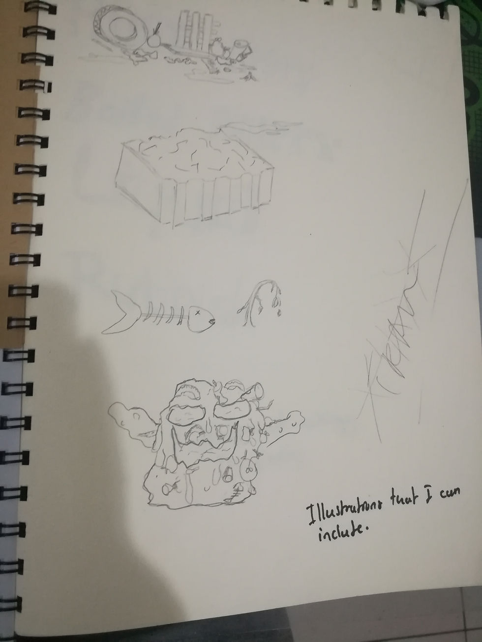
I also made a few illustrations of trash that I see every time on my way to school but this also got discarded because my lecturer told me to save illustrations for the image brief and concentrate more on fonts for the type brief.
So as from here I started to make the typo with a lot of things that I was about to throw in the house, I really just expressed myself in it there was no rules that I was following as I wanted to show how I reused the trash to make art and if I can do that for a typography it means that trash can be used as material for a lot of other things also.
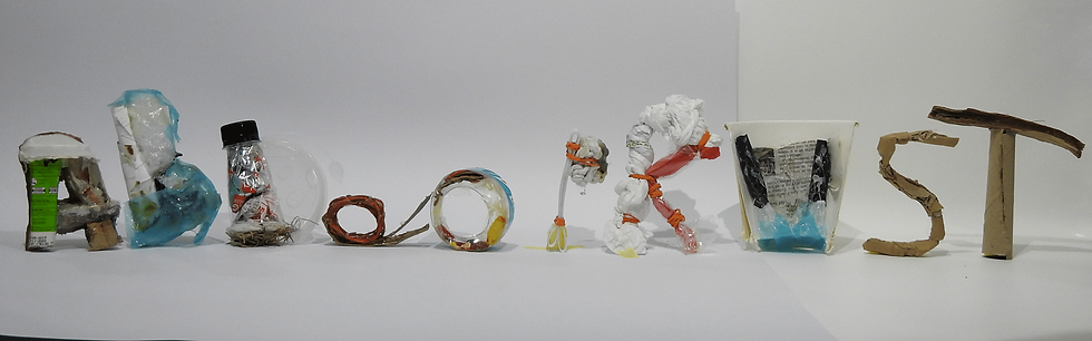
Here's my 10 alphabetes
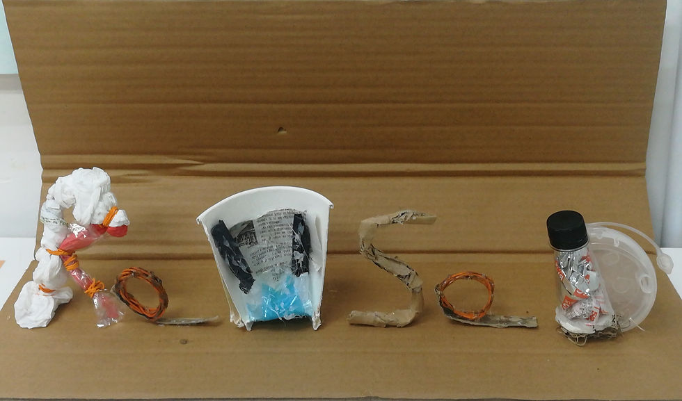
And here's the final work. it's made completely with just trash and glue.
The reviews that I've got was that it was a little bit too common and I didn't explored enough and I realized it just when I've heard it because I agree that i did this one on a rush as the other projects were talking most of my time.
Video of sketchbook

Comments