
Typography and Adobe Illustrator Workshop
- j19031193
- Oct 20, 2019
- 3 min read
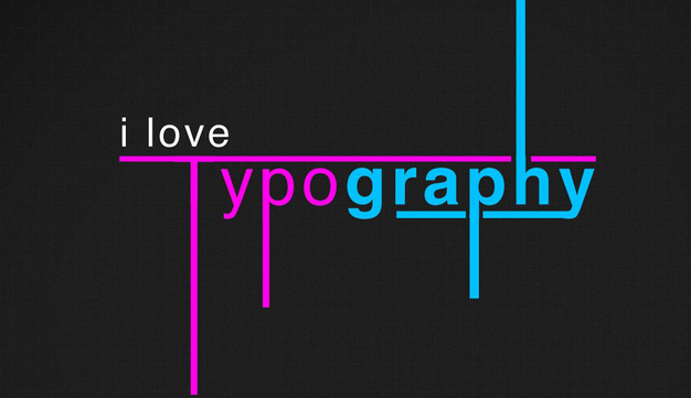
So we had a typography workshop in Design Principles. We learnt that there are 2 types of typography which is Type style and Display style. The type style is more formal and does not really has character or emotions to it. However the display type is the one that can be manipulated more and be more artistic.
Then our lecturer told us to make an illustration based on some fonts that she displayed on the board.

So there was these 2 first which for the first one because it looked very innocent I have imagined a little boy who is very welcoming
However the second one was "punkish" and looked like it's a sarcastic hello because this font looks more suited for something negative so I've imagine a punk guy who is saying hello like he does not care.

As for the first one it was very "glamourious", girly, gentle so I imagined a girl who is very delicate and covering from all the tiny bits of sun and who wear a little bit too much make up.
Then the forth one is that dude who is very upstraight and concentrate more on his work so you often see him with his suitcase in his work suit but also he is very welcoming and nice.
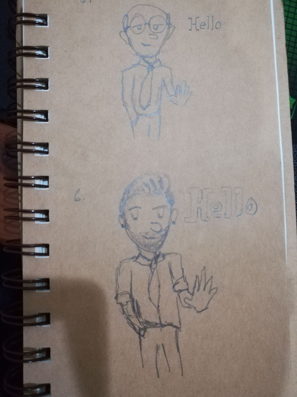
Then the fifth one is that old guy who is even more work oriented and does not really talk about anything else apart from work and will just wave and go back to his own business.
Then the sixth one is a stylish business man who is very cool and nice and most of the time will be seen having fun because work bore him too much.
Based on these we can really see how texts types which is the fourth and fifth really does not have any character in it and just makes you think of work instantly. the sixth one is kind of text style and it's a little bit in between I think because it does have lot more character to it than the fourth and the fifth but still not as much as the first three.
So moving on we also had that work shop with Adobe Illustrator in the mac lab where we learnt to use few things in the software which was very useful and we learnt all that in like 3hrs or something.

We learnt to use the pathfinder tool, the brush tool, pen tool and we also learnt how to manipulate words with the settings available in Ai. It was a bit hard to learn all that in that crash course, there are many things that I already forgot right now but because we have been able to practice it in class i'm sure I will be able to remember when I will have Ai opened in front of me haha.
We also had practice with the pen tool which seems very easy to use to make simple illustrations or cartoon characters. We basically learnt a very simple way of practicing the pen tool which is just by tracing out simple designs out of the internet which I need to start putting into practice now.
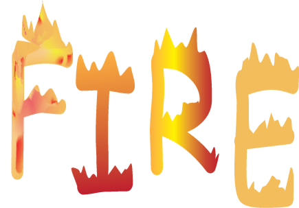
But yeah, here's something that I've tried in class for the classwork we had to do which was choose a word and turn it into what it actually means to illustrate it more. To make the lettering it was pretty straight forward just typing and playing with it's shape with the pen tool and direct selection tool to move the points and stuffs. But the real fun was when painting because I got to experiment with the mesh tool which did a lot by simply just clicking. I also experimented with the gradient tool.
Illustrator is a very amazing and quite simple software to use, it will just be a little bit daunting at first because i'm not used to the interface and all but I feel a lot more confident to mess around with the software now and try doing something out of it. Before the crash course I thought it would be too hard to learn on my own as I know that Adobe softwares are lot more complicated than simple softwares that I use like Krita and Medibang.

Comments