
Natural Impressions (Typography Experiment)
- j19031193
- Oct 19, 2019
- 3 min read
So we had a trip to Kuala Lumpur Eco Park and was divided into groups to make a typography experiment where we had to look for
a playful place
a peculiar place
an exasperated place
a captivating place
and form a visual imagery with a typography of the adjective of the described places made with objects or materials available at the Eco Park.
Oh, the project was also a collaboration with our other subject which is Design Process but it's a totally different outcome for that one.
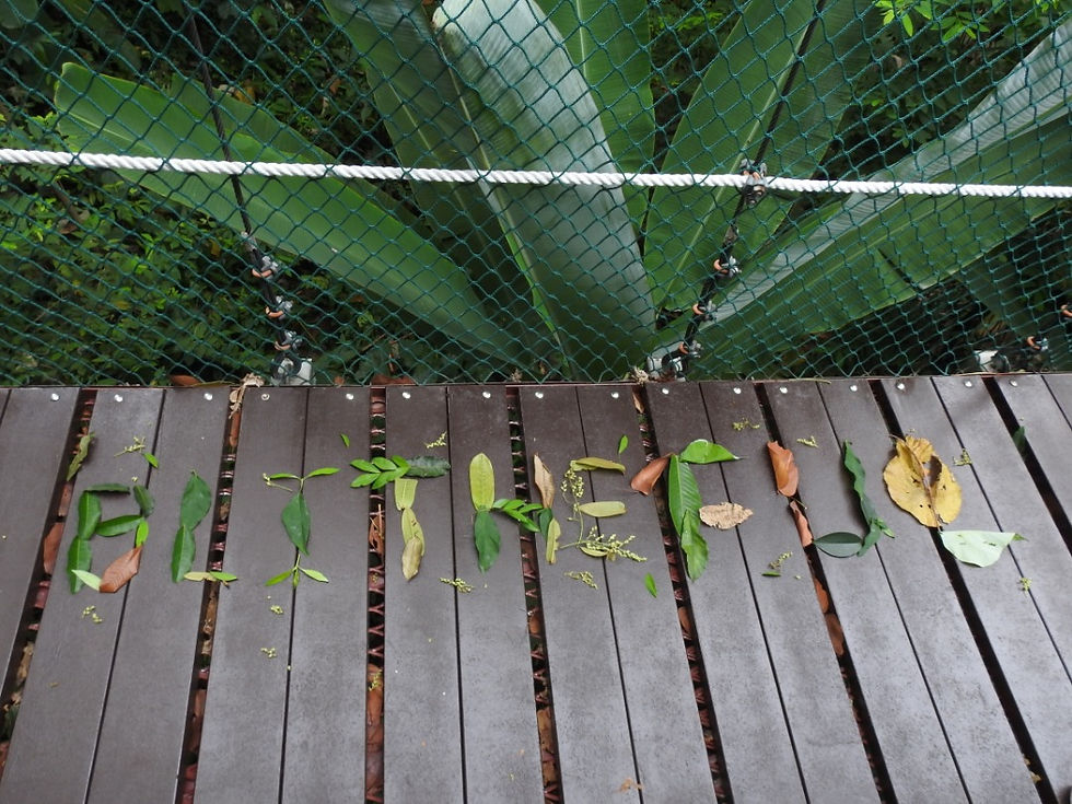
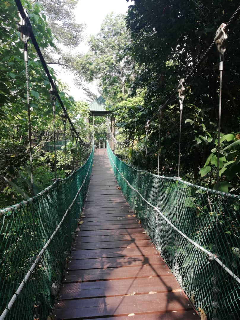
For playful the adjective that we chose was blitheful which means joyous, carefree or happy. We made it on the bridge because we felt like kids on there and was having fun to jump or run on it so that it would swing. We made it with leaves of green, red and yellow colours because these colors represent peace, joy and happiness. And also leaves represent purity and what is purer than a child. We felt like child on that bridge and that is another reason why we chose leaves to represent it.
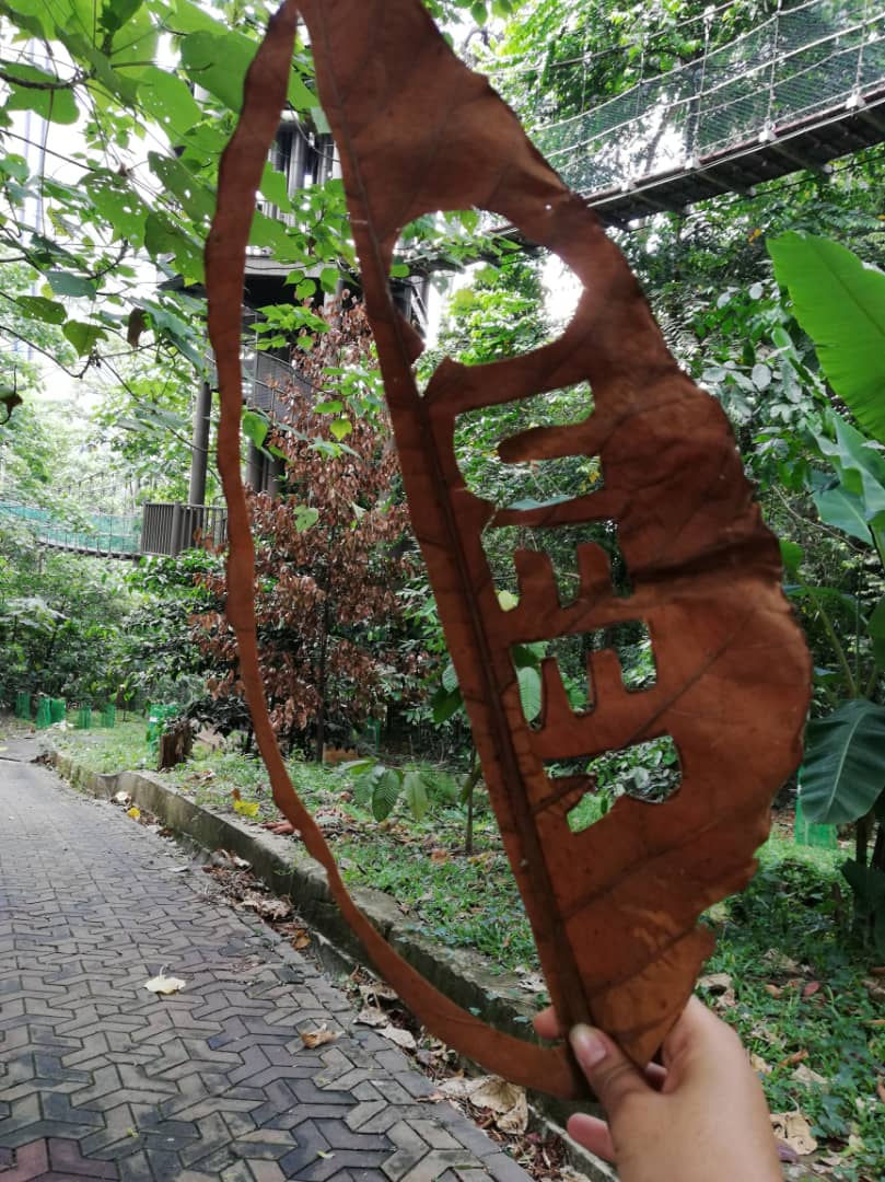
For peculiar we had the word queer which means strange or odd and it really fit that scene that we had of that one and only dying tree in the park. It is a huge brown tree in the middle of all these green trees and it really made a beautiful contrast and caught our attention. We decided to make the typography on a dry leaf and made a cut in it to drive your attention to that dying tree. This piece of work was also further elaborated in the Design Process project...
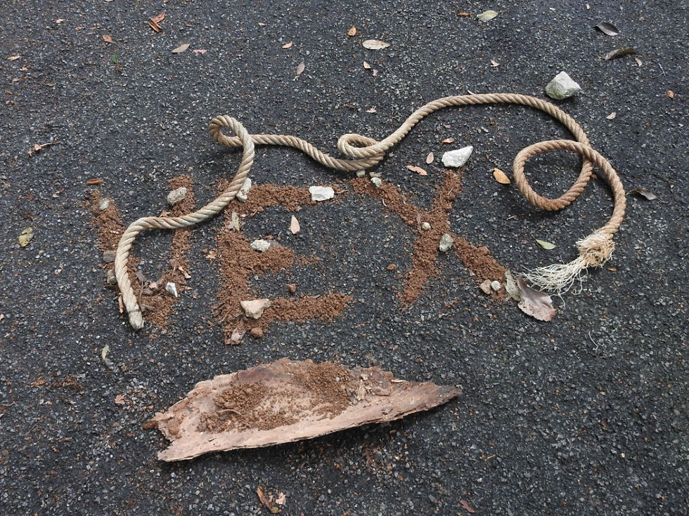
For exasperated the word we chose was vex which means angry or annoyed, and we chose to do it on that steep concrete path that we had to climb to get inside of the Eco Park as we were all very annoyed after climbing it as we were already tired and had not yet started the work. We made it on the concrete road itself to get that dark rough texture to represent our frustration and the word vex we made it with soil because it's very dirty and give you an annoying feeling when touching it. We added stones on the word and a piece of wood just to highlight the roughness of the message. And lastly we added a rope that is twisted just because we felt like we were being pulled inside the concrete after climbing this steep path as our legs were giving up.
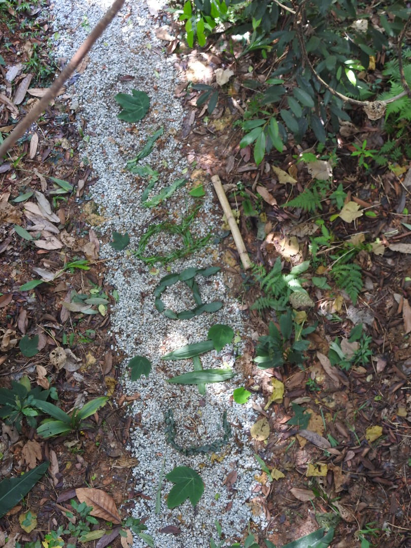
Lastly for a captivating place we chose this path that we found while walking on the bridge which looks very attractive to us. We chose the word charm as we felt under the charm of this place haha. We decided to make it with leaves again as leaves are very attractive and green color is very welcoming also. the rest was done by mother nature herself the white rocks that created a serene feeling in the composition and the dead leaves and small plants all around emphasis the charm of the place. It was really a very captivating place.
So that's the end of it, this whole experiment was a very amazing one, I have learnt how to use the environment around me to pass a message, I have also discovered a new creative way to use typography instead of just writing on paper or typing on a computer, I have learnt how to mix typography with a scenery to pass a message. However it's not a method that can be applied everywhere at any time but if used properly it can easily become something very original.

Comments